Our Project Goals
The Mustard team approached us with an existing codebase and early startup learnings. Our job was to adapt what Tom House had honed over so many years and make it fit into a mobile-first experience, marrying the latest in hardware and UX.

The Problem
Quality coaching is expensive and unattainable for most athletes. For those who do have access to these coaches, the insights gleaned from training sessions aren't actionable.
The Solution
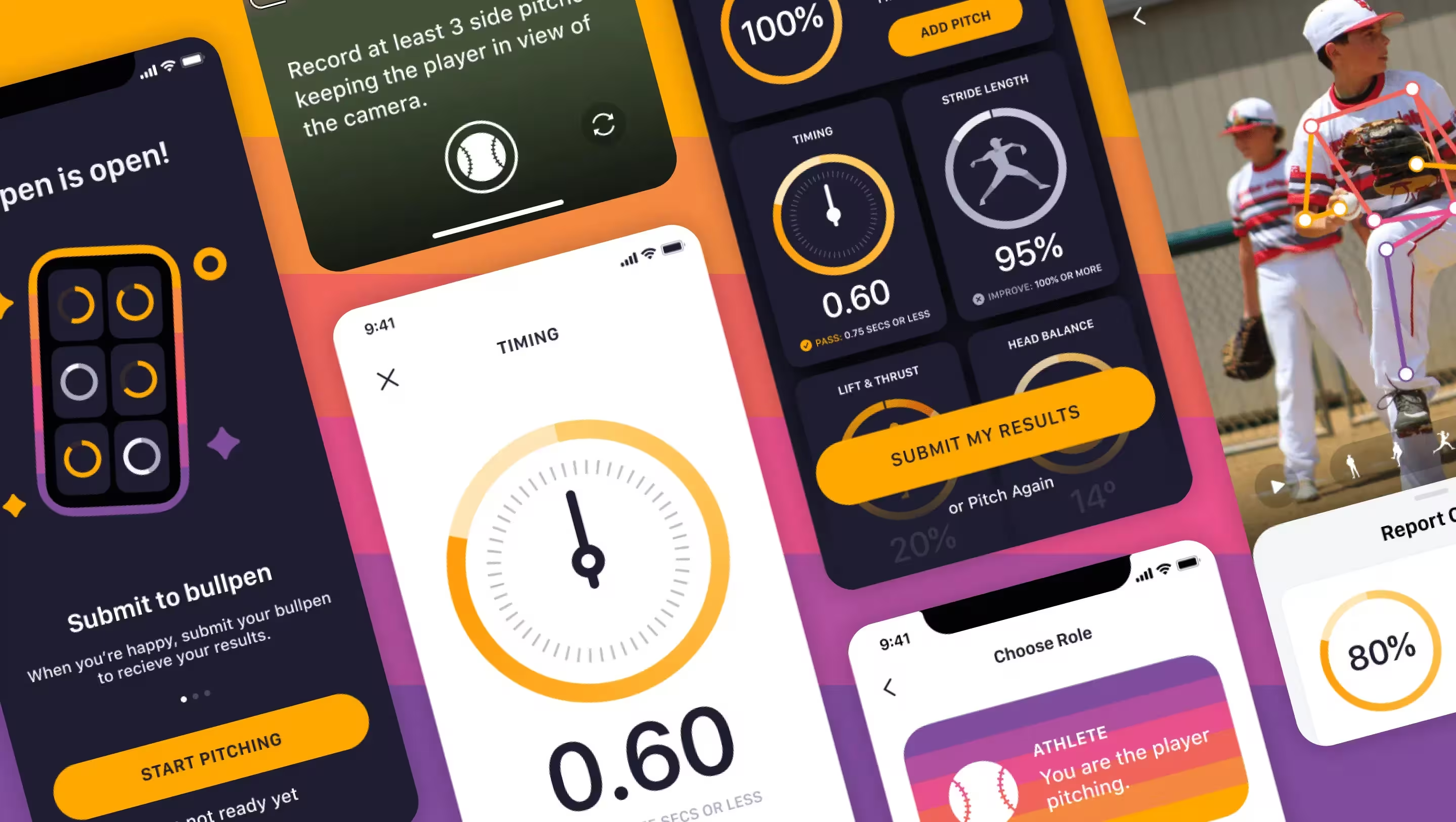
Utilizing famed coach Tom House's forty years of data analysis, Mustard is able to democratize quality coaching.
Mustard gives same-session feedback and personalized instruction based on biomechanical data from the world's best players.
Timeline
We brought a fully redesigned product to market in 8 weeks that reflected our core user journey - capturing a pitch, sending that pitch for analysis, and then presenting a report back with drills & learnings.
This speed to market was crucial in onboarding a foundation of beta users who would later provide valuable feedback on Discord, during in-person sessions, and on calls. These beta users would enable the Mustard team to raise additional fundraising based on their retention and engagement metrics.
User Types
When working on a product that engages multiple user types, we had to consider each of their experiences.
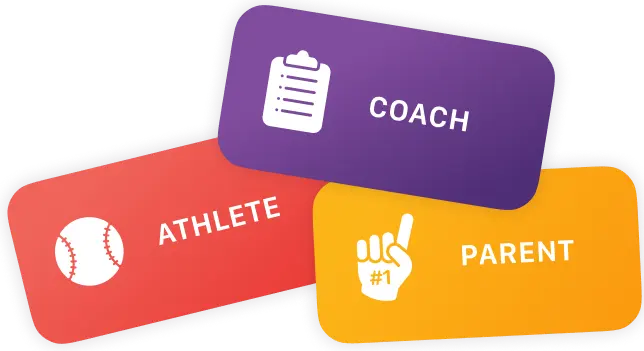
For Mustard we identified: the student athlete (who may be using their parent’s device), the parent, and the coach.
Each user type’s needs permeated throughout the product - from the subscription tier offerings, to the appropriate access and visibility, we had to consider who was paying and who was capturing / viewing content at each step.
Engagement
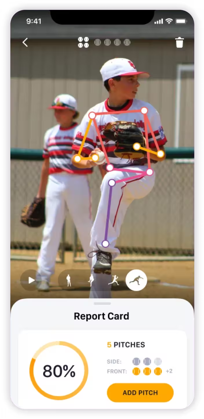
We hypothesized that pitch analysis was a retention driver and dug into the analytics to understand this behavior better. As we suspected, athletes who viewed their report card were more likely to return and engage.
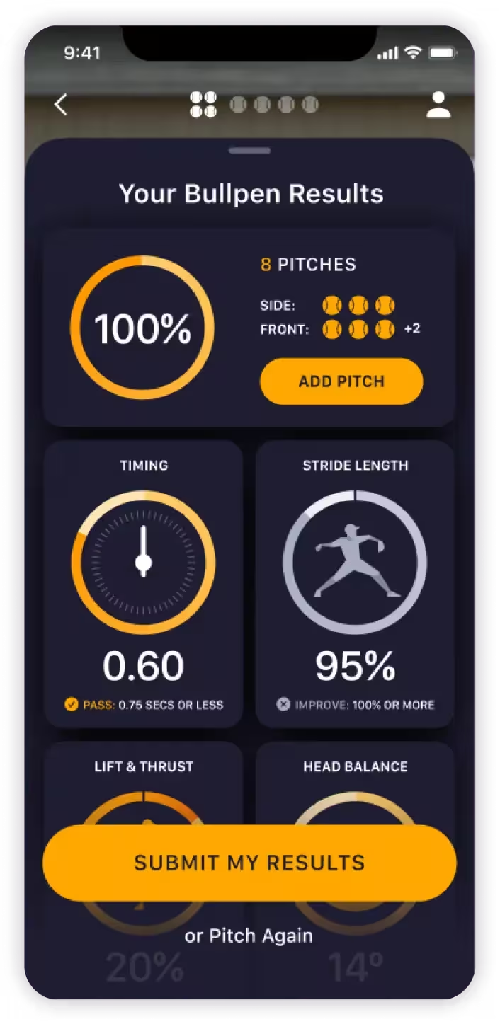
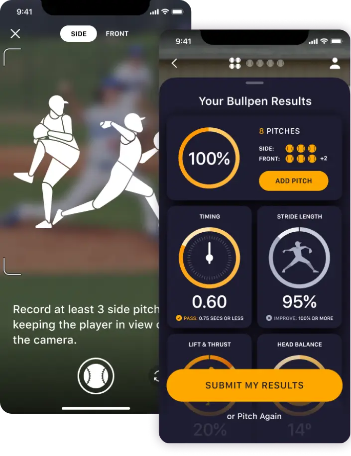
The Bullpen Report Card
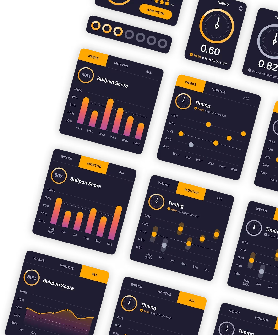
The product team identified this magic moment as an opportunity to build habit and routine for users to stay focus, gain weekly insights, and grow.
Our design team mirrored the real-life routine of a student athlete by building a digital representation of that moment athletes step into a bullpen with their coach.
This ceremonial pitching session is an opportunity to test the week’s progress and see how it effects drill recommendations and progression plans.
Push to Hold
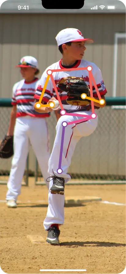
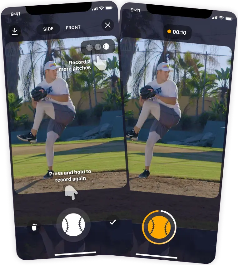
During in-person training sessions with users, we watched as real users captured pitches and interacted with the product.
Following these sessions, we were tasked with how to speed up analysis to support real-world scenarios between coaches, parents, and athletes. Our understanding of user behavior and expertise in UX allowed us to provide a much better product experience. By leveraging a push to hold mechanism, we made content capture easier in a collaborative instructional environment.
