Think your digital product could use a teardown from award-winning designers for free? Apply here.
As part of our UI/UX teardown series, our team identified the Carson Living iOS & Android app - a residential real estate app for tenants and landlords. The review was personal, as many of our team members live in Carson buildings and interact with the app daily.
User interviews and app store reviews highlighted recurring themes that we looked to solve - security concerns, UX misunderstandings, and a suboptimal visitor pass management tool.
The Current Landscape
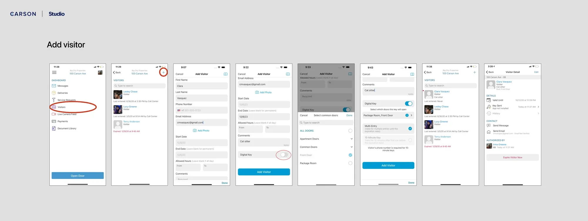
Carson Living currently allows tenants to create and share keys for visitors to access. Tenants input information about the visitor and their visit details like date, time, door to unlock, and expiration period. When appropriate, the app triggers a text message to the visitor with the opportunity for them to text back for door entry. The feature is theoretically killer for tenants - it allows them to manage deliveries, friends, babysitters, cleaning folks, all from afar. But in reality, the clunkiness of setting up a visitor in-app and the security concerns of sending out never expired keys, make the feature fall flat.
Our Vision
We looked at solving this key management system in a few core areas:
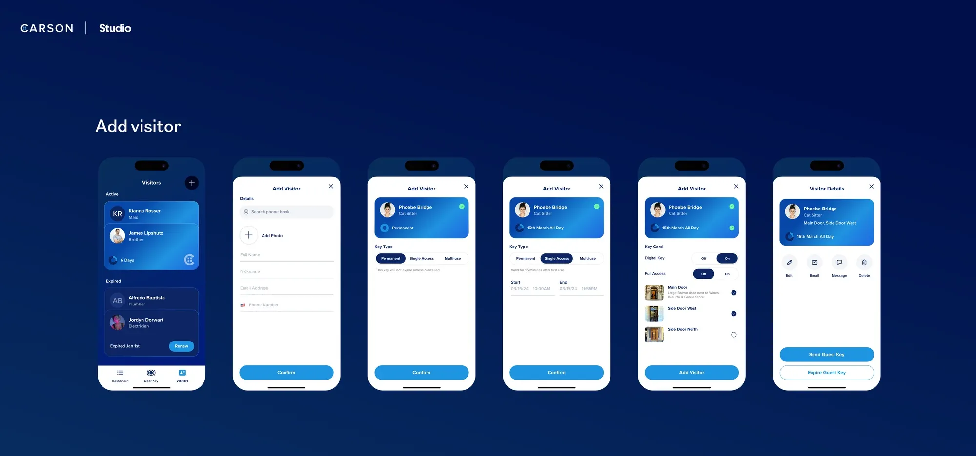
Simplified Input: We optimized the add visitor flow by condensing menu options and prioritizing common methods such as phone contact search, facilitating faster interactions.
Enhanced Security: To mitigate security risks, we introduced visual cues for entry duration options, ensuring users accurately select the appropriate access level for visitors.
Clear Door Selection: Instead of a static list, we proposed visualizing doors to provide context for both residents and guests, enhancing clarity and usability.
Visual Refinement: We revamped the visual representation of visitor passes to mimic physical passes, providing a more intuitive interface for users.


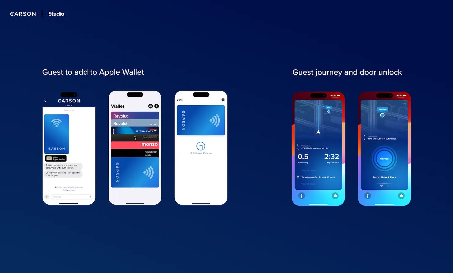
Location-Based Functionality: Utilizing Apple widgets, users can receive real-time proximity updates about their visitors.
Integration with Apple Wallet: Passes can now be seamlessly added to recipients' Apple Wallets, offering convenient access and reducing reliance on manual entry methods. The phone leverages native device NFC/tap functionality, so residents can utilize an in-app keycard or Apple Wallet pass to unlock doors effortlessly.

Implementing the above will elevate the Carson Living user experience while maintaining simplicity in visitor entry. These enhancements not only streamline operations but also prioritize user safety and convenience—a win-win-win for Carson, its residential building customers and building tenants.
For more intel on this teardown, watch our deep dive here.
Think your digital product could use a teardown from award-winning designers for free? Apply here.

