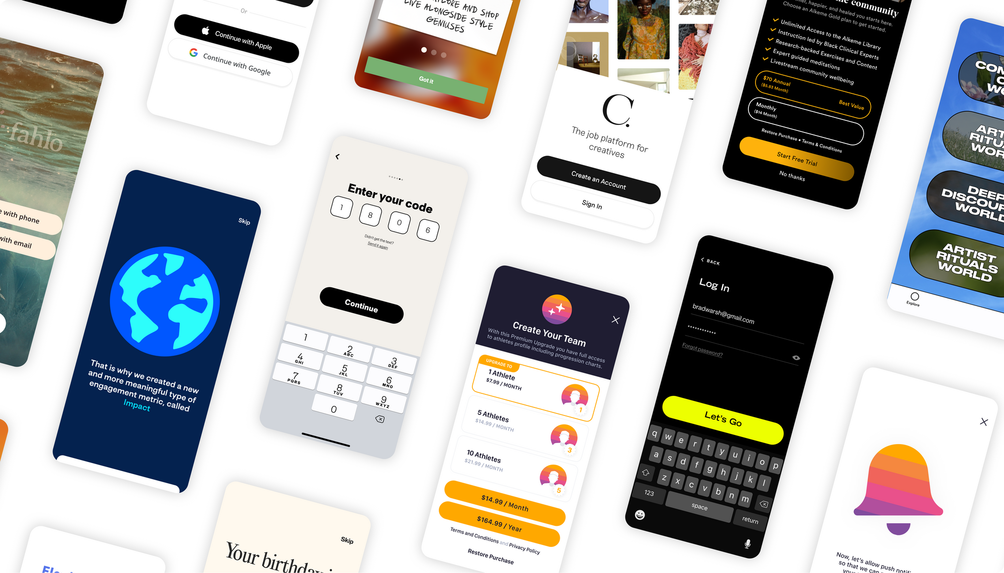
Onboarding new users is simple in theory but hard to get right in design and execution. There is a lot to consider, and it’s not always easy to know the answers to questions like:
- What do users need to know about features before sign-up?
- Where do I put subscription offerings?
- When and how should we integrate with social authentication?
This guide – rife with examples and walkthroughs – was created to help you create an app onboarding experience that works. An onboarding that communicates the value of your app effectively, is enticing enough to get users to click “sign up,” and is designed (literally) to give you the best chance at converting those sign-ups into paid users.
Feature Education
Most new app users want to know what lies behind the sign-up wall. If they don’t, they might not be compelled to keep going. That’s why a thoughtful product feature page is your friend when it comes to onboarding.
Overall length and critical features
This might be a “kill your darlings” moment, but you don’t need to pack in every cool app feature in onboarding. Think about what’s going to push a user over the finish line fastest. You need to understand what your ideal demographic cares about, and what makes your product unique (UVP).
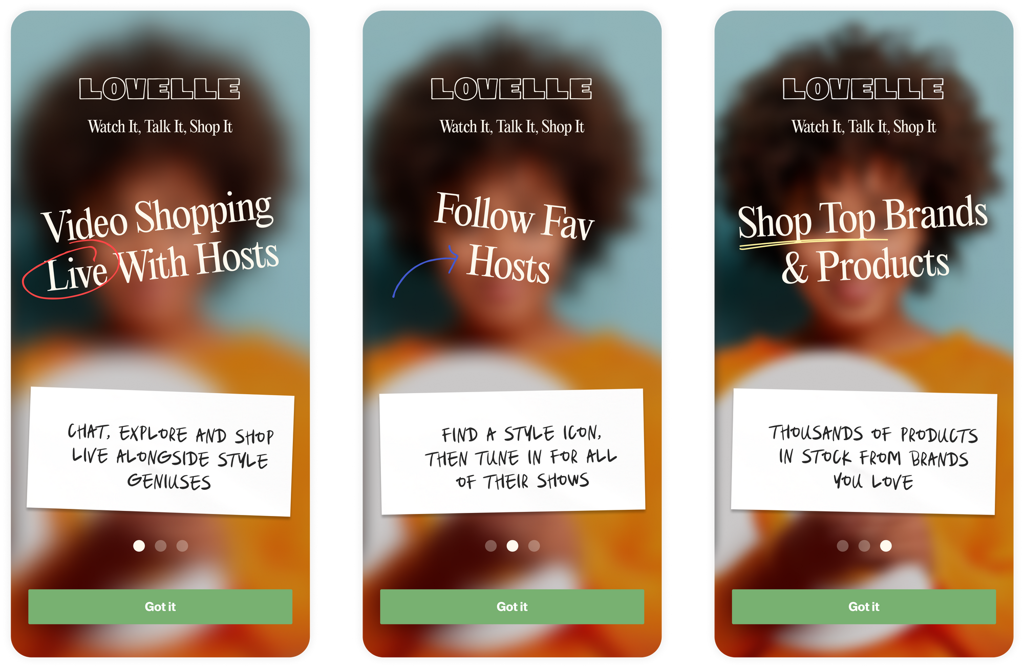
When designing this screen for a QVC shopping app, we opted for a short and to the point explainer. Just a simple three-step introduction with minimal text but a crystal clear value for their target user. Attention span is short, so we kept onboarding to that pace.
Walkthrough design
Is your product walkthrough absolutely required reading for all users or can you make it optional? It may make sense to create an option to skip straight to “Sign In” for those users who are coming to your app already educated (or at least confident) in your features.
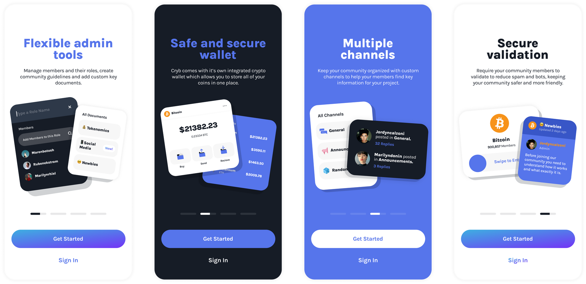
For Cryb’s “social wallet,” we created the feature page as a swipeable carousel which appears before Sign In. It’s optional and at any time a user can click "Get Started" to skip the noise.
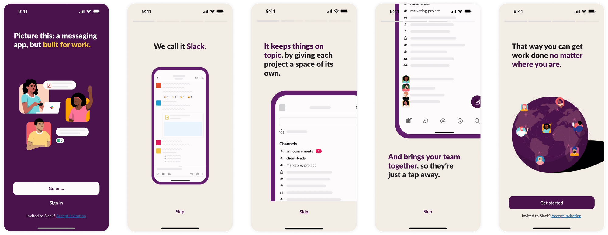
Slack’s feature page is another great example of this. It appears for a first-time user that needs to create an account, but is skippable by tapping either “Sign In” or “Skip.”
Pattern play
You’ll want to think a lot about user experience when you’re designing your walkthrough. In addition to branding, consider which patterns help convey the walkthrough process most successfully/succinctly to users.
Options:
- Large branded visuals to illustrate the “why” of your product
- Illustrations that demonstrate functionality
- 3D renderings or other technical drawings that step uses through connected tech
Best practices for communicating value
Don’t overwhelm first-time users with details or complex visuals. Make your feature walkthrough as compelling and easy-to-use as your app. Answer the questions that matter to users: where do they need to go, what will it look/feel like, how are they going to be better on the other side?
As a note: this part of the onboarding doesn’t need to teach users how to use every feature within the product. It’s another indicator of your app’s value, not a feature wizard. Ideally, your UX is strong enough within the product, no additional explainers are needed. However, they can always be added at the time of interaction or based on analytics findings post-launch.
Subscription strategy
You’ll want to have a compelling subscription option as a part of your onboarding to entice users to start paying for your product. But don’t throw up a subscription wall too early, as it could drive away or confuse potential paying customers. We highly recommend having a freemium model for your app so that any interested user can get a taste of your product before they commit. (For what it’s worth, Apple recommends the same)
How it works when it works
There are some intricacies to how and when to introduce a paywall. You’ll definitely want to start with a visually impactful introduction screen before presenting your subscription option that clearly outlines the value and the relevant details (tiers, cost, cancellation, etc.). This can occur before, during or after account creation.
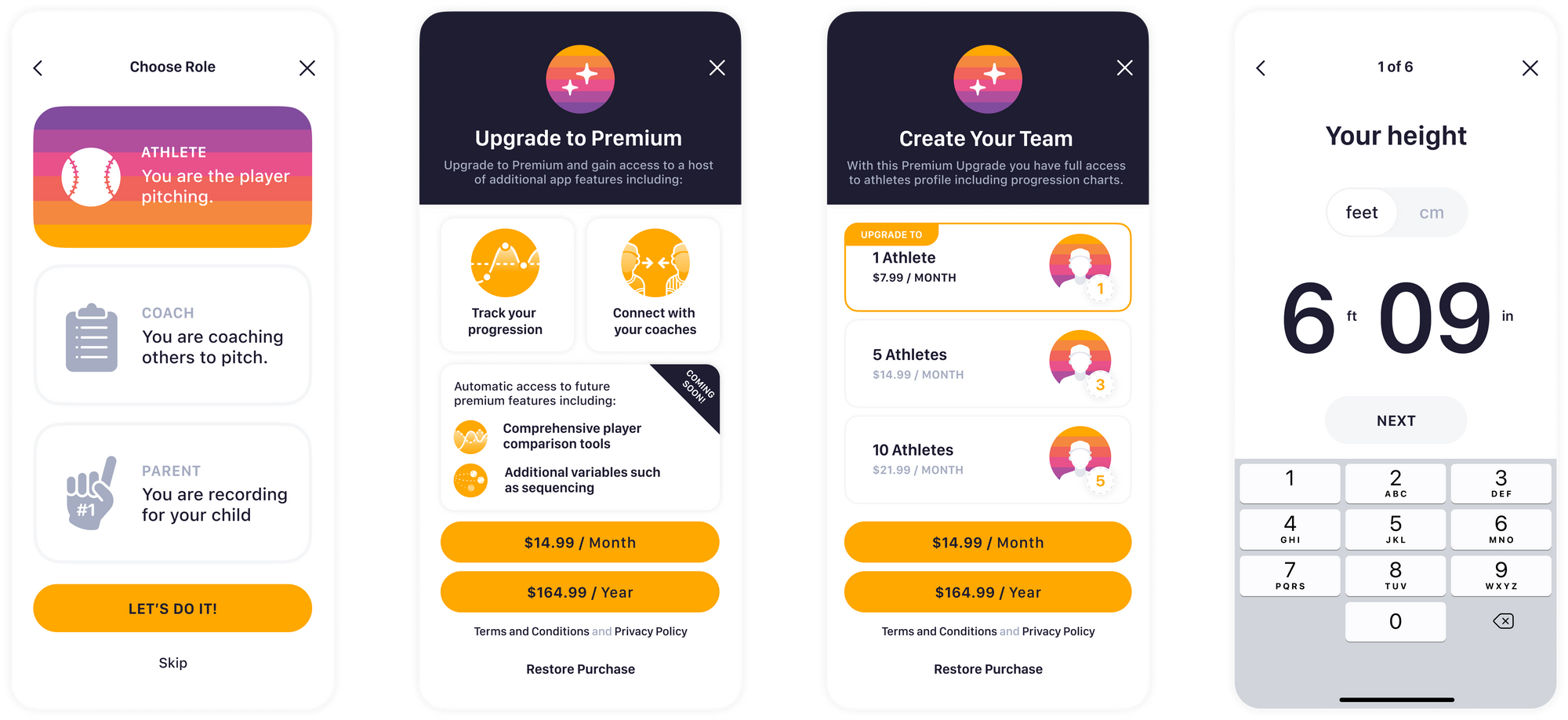
For baseball pitching app, Mustard, we created a drawer that slides up midway through onboarding to encourage users to subscribe to gain access to extra features and based on their user type.
Tiers
You’ll also want to make your subscription options and value crystal clear. Make sure to visually outline all of the benefits for each tier that you offer, and include details about any free trials. Consider how upsell opportunities to a different tier can tie into user features later on in the user's journey, rather than trying to upsell at the start.
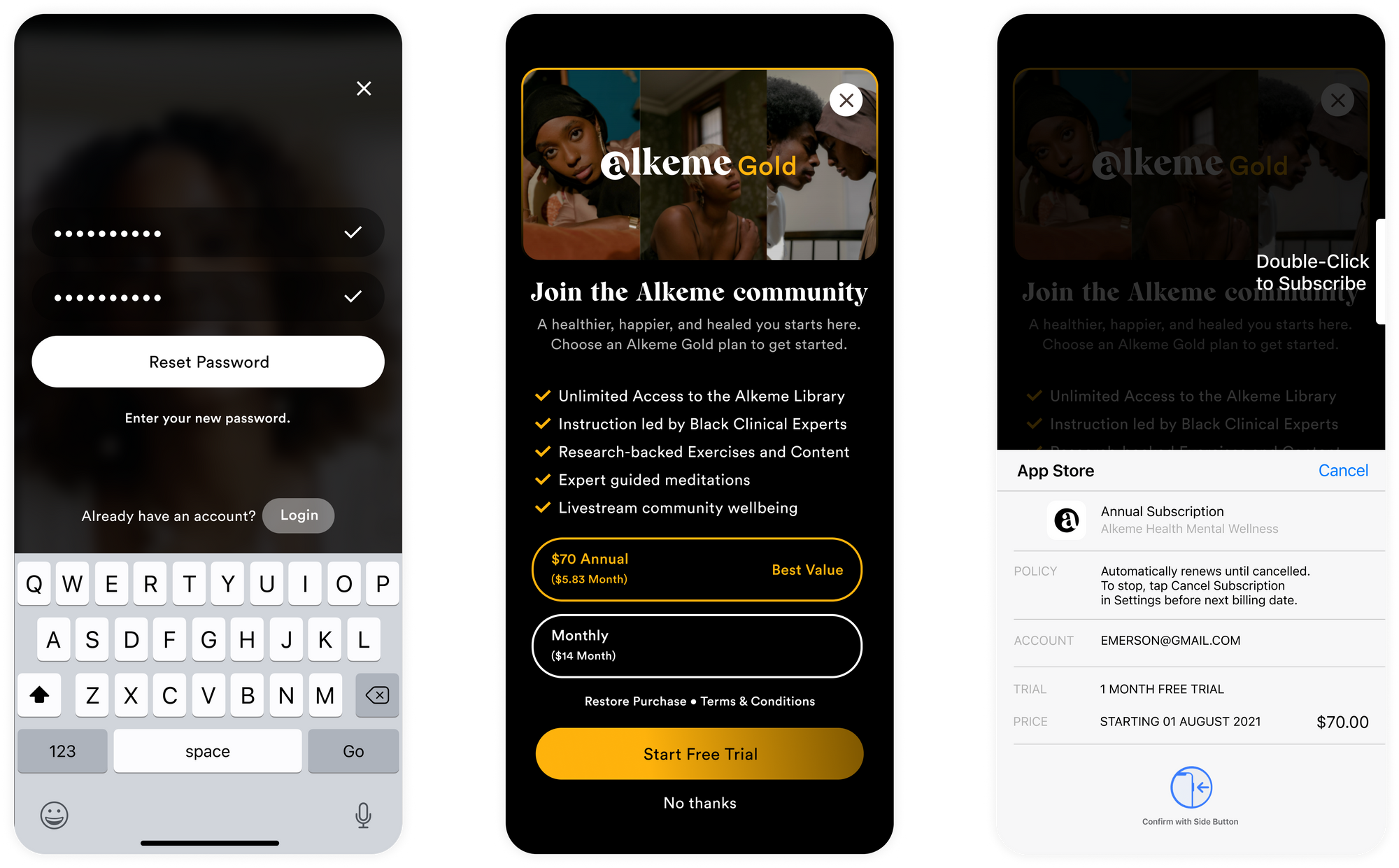
For Alkeme, a digital health platform, we created a screen to show their single subscription tier with multiple benefits. We made sure to clearly outline pricing and show users options to skip or restore their purchase.
Timing is everything
Earlier isn’t always better, but there are apps who push toward subscriptions at the beginning of onboarding and have success.
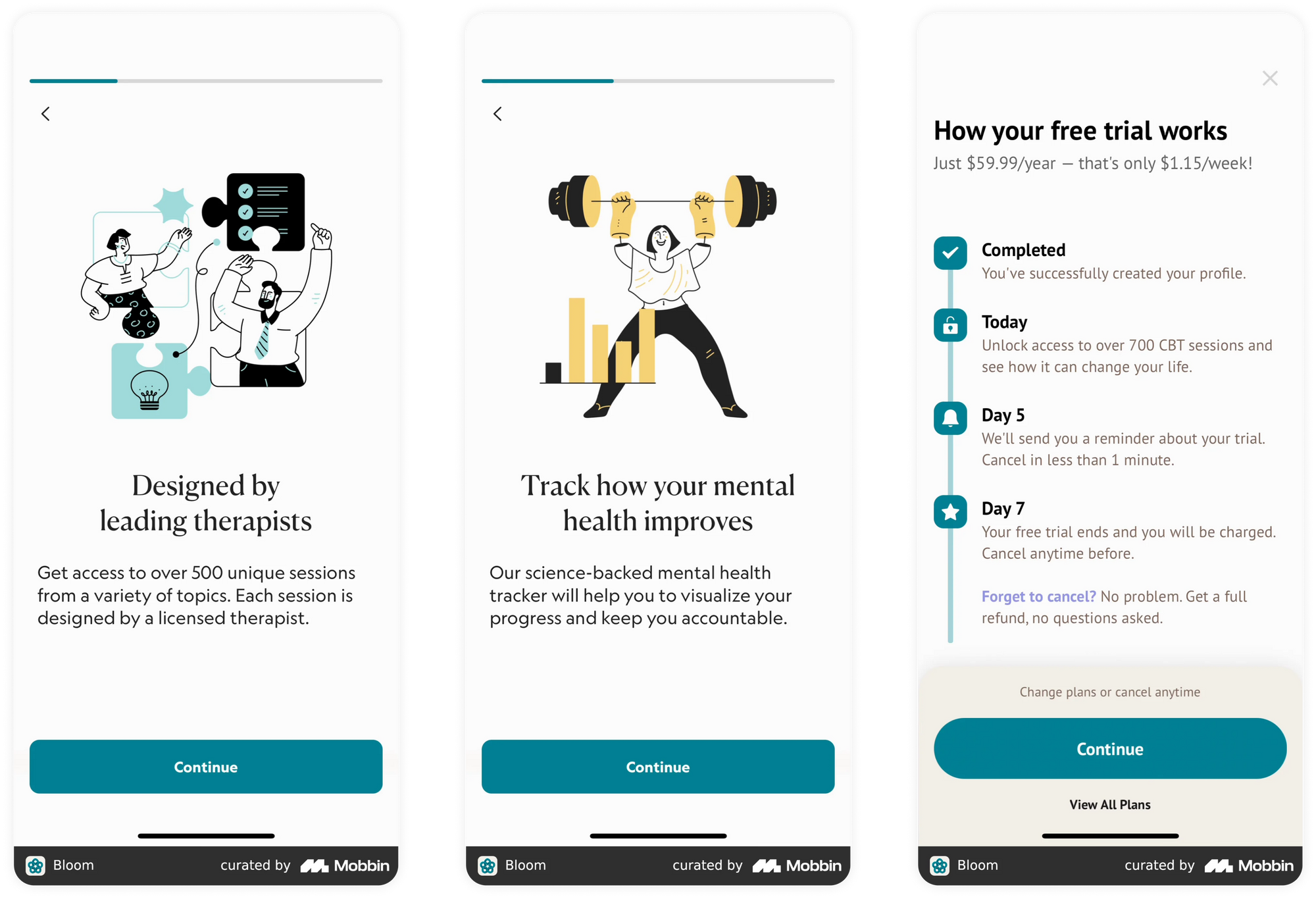
Bloom’s self therapy app shows subscription options right at the beginning of onboarding, and makes the value of their model clear over the course of several screens.
Other winning subscription pages
There are a number of ways to visually outline your subscription offerings and details. We found some great examples out in the wild that use:
- Progressive graphics to introduce subscription plans (Babbel)
- Split/swipeable sections on a single screen (Bumble)
- Concertinaed format (FEELD)
- Tiered screen with savings tag on top (Skillshare)
Notifications
Push notifications are a necessary feature and how you’ll market and reengage your app users. But if you just flat-out ask for permission to send notifications, most people will say no. (I mean, wouldn’t you?)
Explain why you're sending notifications. What value it brings the user. By using visual language to engage and excite your users - and placing your notification ask in the right position in your onboarding flow - you can illicit an enthusiastic yes. They won’t just allow your notifications, they’ll want them.
Go native
One great way to make notifications feel integral to the app experience is to design around and for the native notification module.
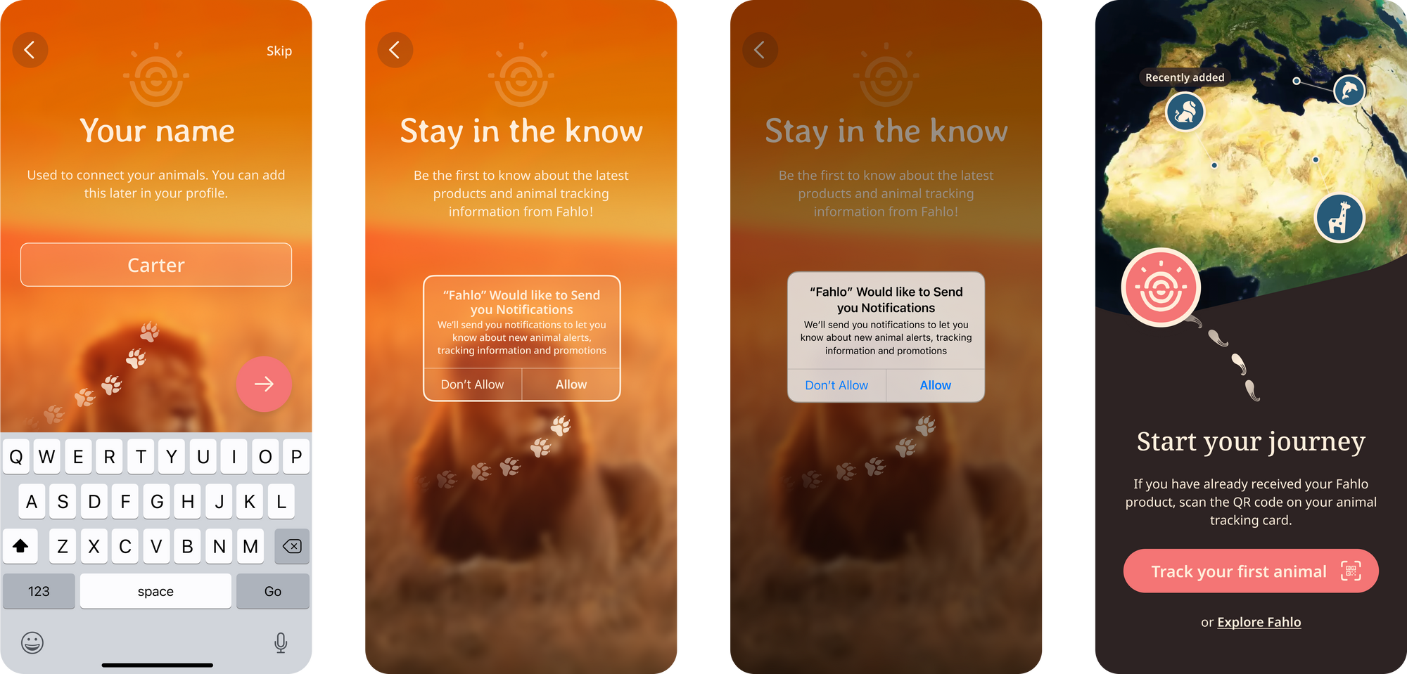
For Fahlo, a wildlife tracking app, we encouraged and nudged users towards allowing notifications by including a designed, tappable, module that shows up before the native overlay appears. But more importantly: we explained why giving permissions to the app has real value for users - more animal content and movement updates, something the user asks us for already.
Stay consistent with TOV
No matter how you’re asking, make sure to use your brand’s tone of voice (visually and in copy) to embellish an often generic permissions screen.
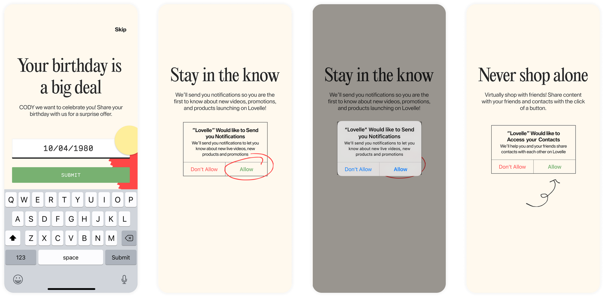
For Lovelle, we kept their playful branding and used illustrative elements to bring full user attention to the “Allow” button on the notification screen.
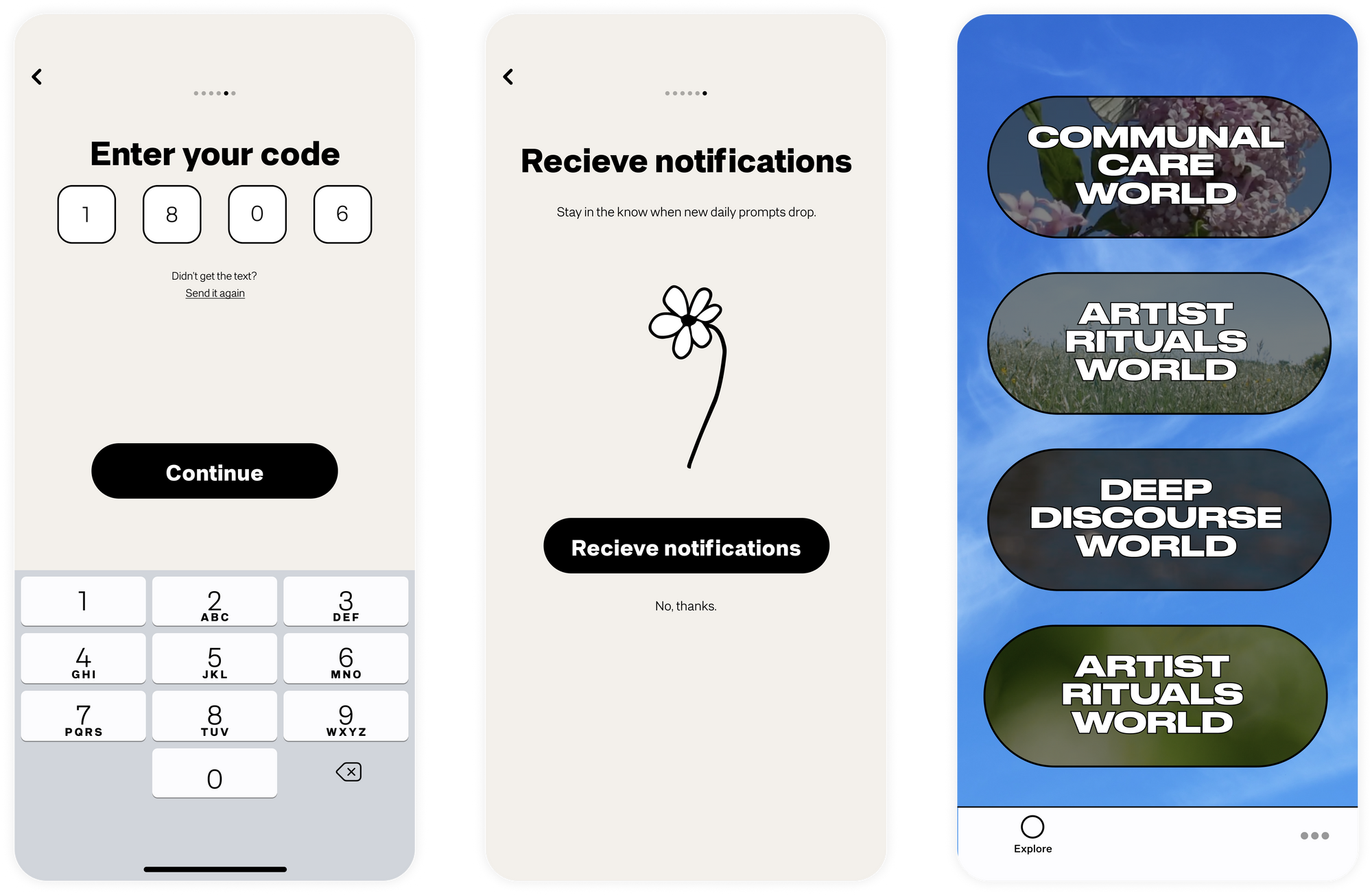
For Somewhere Good, the audio-centric social platform, we opted to show the notification screen at the end of the onboarding flow with a simple/whimsical brand style.
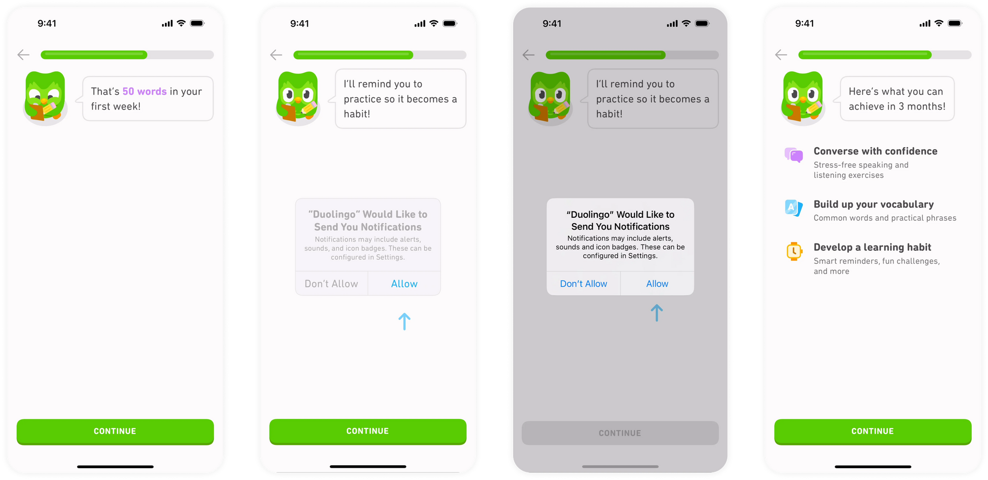
Language learning app, Duolingo, similarly includes a notification screen towards the end of a data gathering flow. They also use their owl as a brand mascot to ask the user questions.
Make it visual
In order to make your ask more compelling, decide how you’ll visually outline all of the benefits a user will get from pressing “allow.” Can you show exactly what features will be enhanced with notifications? How else can you make notifications feel necessary and simple?
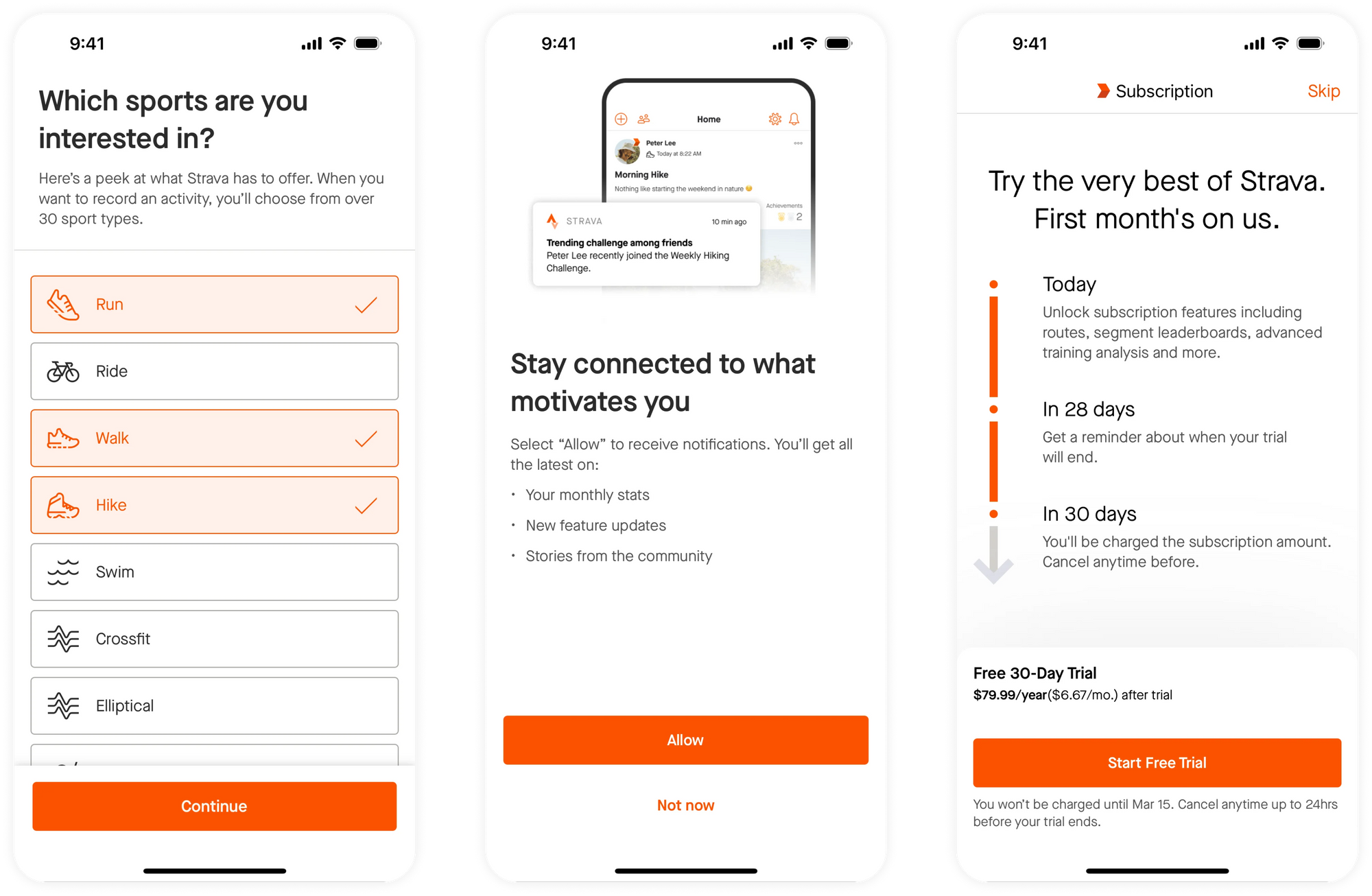
Fitness app, Strava, shows visuals of notification examples so that users know exactly what to expect. This demonstrates value, but it also relieves any trepidation around whether notifications will be bothersome/intrusive.
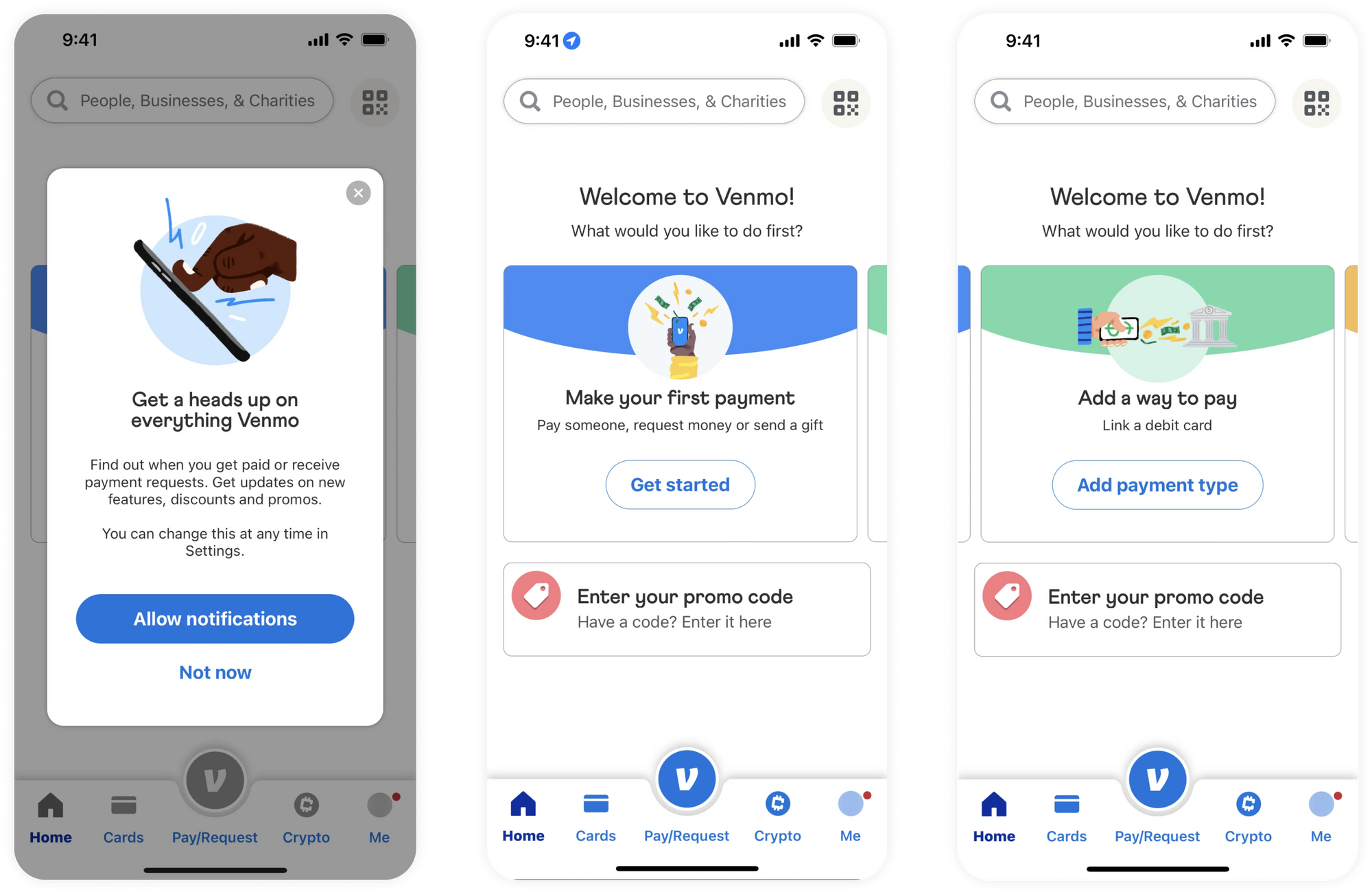
Venmo, the popular mobile-payment app, shows a modal pop up after onboarding and before landing on the homepage to very clearly answer the “why notifications?” question.
Friend Invites
This onboarding screen is where you’ll encourage users to invite their friends to use your app. It’s hugely important for top of funnel growth. If you pull off friend invites successfully (think of social-engagement apps like Clubhouse or Beli) you’ll expand your user base fast.
One goal is to capitalize on the all important “K-factor:” a metric used to measure how likely a product or service is to spread through word-of-mouth or recommendations. A powerful KPI. Getting permission to view a user's contact list can be a crucial part of onboarding, even if you don’t get users to invite friends right off the bat. It can help you create a social graph of who is connected to the product, which can support invites and growth down the road.
Make the benefit of invites clear to both sender and recipient, and you may be able to compel users to start combing through their contact list - or at the very least, letting you.
Friends with benefits
Make it clear what they (the user) or their friend will receive in return for inviting them to your platform. Discounts? Freebies? A more premium app experience?
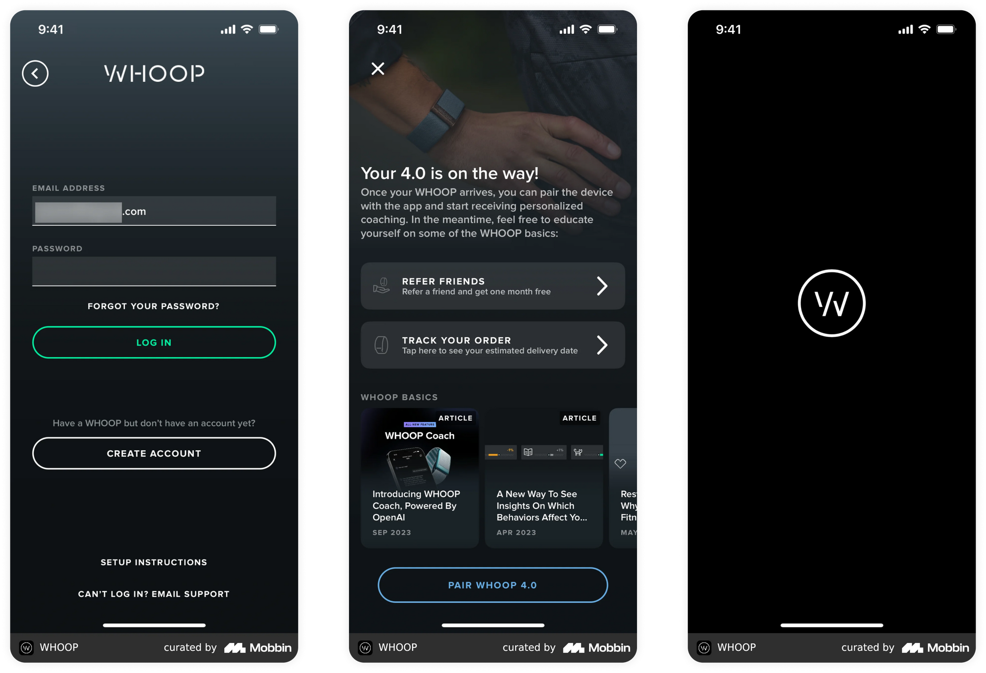
Sleep app, Whoop, offers a 1 month free membership when you invite a friend. This happens right after sign in, and is clearly stated on the invite screen.
Make the mechanics clear
Show users exactly what’s involved in the invite flow/process. What’s expected of them when sending the invite, how will it show up for their friend, and what are the necessary next steps?
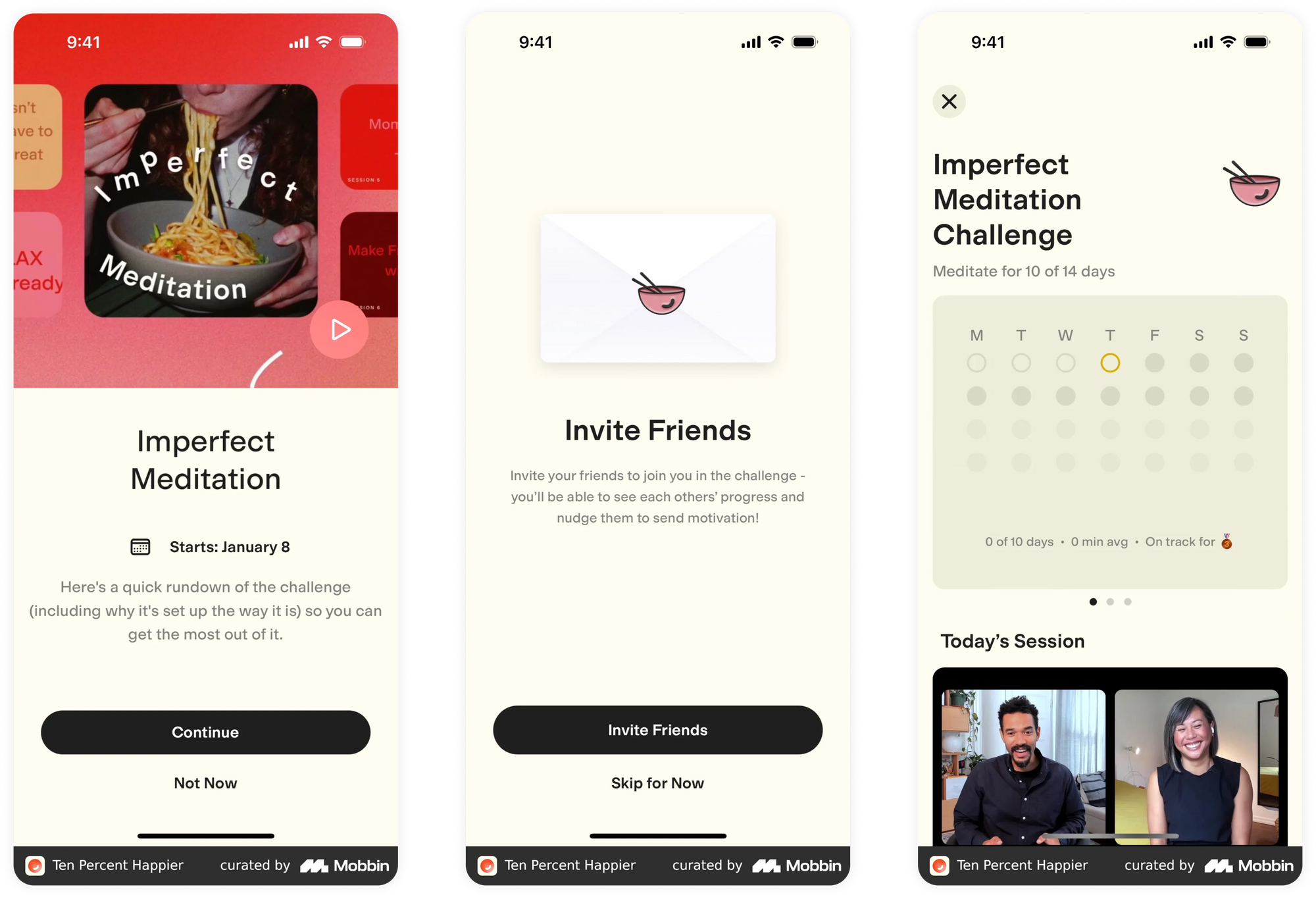
The mindfulness and meditation app, Ten Percent Happier, encourages users to collaborate with friends on challenges. In a series of invite screens they explain how users will learn about the challenge, what happens when they invite friends, and how their challenges will appear in the app once initiated. This sequence happens at the end of onboarding. Gamification paired with friend invites is a killer combo.
The invite flow
When considering a friend invite screen, you’ll want to be clear on whether the invite friend flow effects the core functionality of your app. Are invites at the center of what your app does? If so, it’s worth providing a visual walkthrough so users can see exactly what they (and their friends) are signing up for.
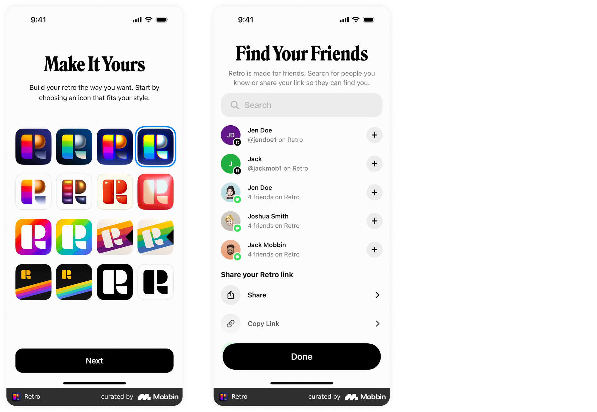
Social app Retro uses multiple methods on one screen to invite friends to the app. Inputting contacts is imperative to app functionality, so they provide a contact sheet to quickly add contacts in your existing phone book, a share button and a copy link.
Look and feel
The biggest technical question you’ll face when designing your friend invite screen is determining how to integrate the “invite friend” button into the UI and how it then translates to native invite functionality. Keep in mind how a user might nudge an invite to a friend, and what the invite looks like - what copy gets sent to that friend.
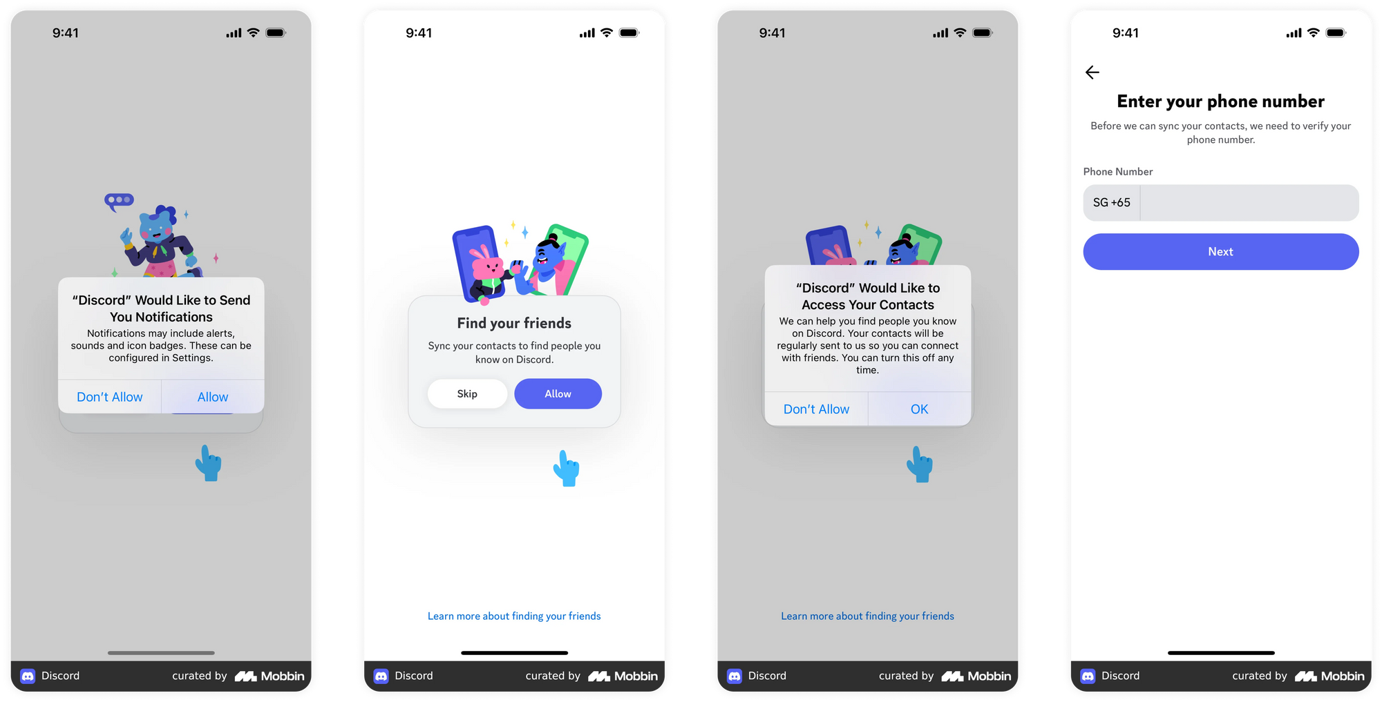
Discord, the social/gaming app, uses the same styling and pattern as the notification screen to sync contacts. This keeps users “in the flow” and makes the native modules feel like an integrated part of the onboarding experience.
Last thoughts on invites
Every app is going to have different needs when it comes to friend invites. For some, a permanent invite friend module will make the most sense (especially true for social apps or those that require large networks to provide the most value). For others, a one-time invite pop-up might do the trick. Consider both UX and UI when designing your invite screen(s).
Customization and Data Capture
This won’t apply to every app, but for those apps that require information from the account holder to personalize the in-app experience, creating a thoughtful data capture screen is crucial. You’ll want to engage in some serious hand-holding to make sure users are inclined to fill in the necessary data. It’s up to you to decide whether this piece of the onboarding puzzle is necessary.
Just the facts, ma’am
When designing any customization or data capture screens you’ll need to know exactly what data you want to collect during onboarding. Start by thinking about what mechanics of your app will benefit most from customization during onboarding. Use those insights to guide you when deciding on data to collect upfront.
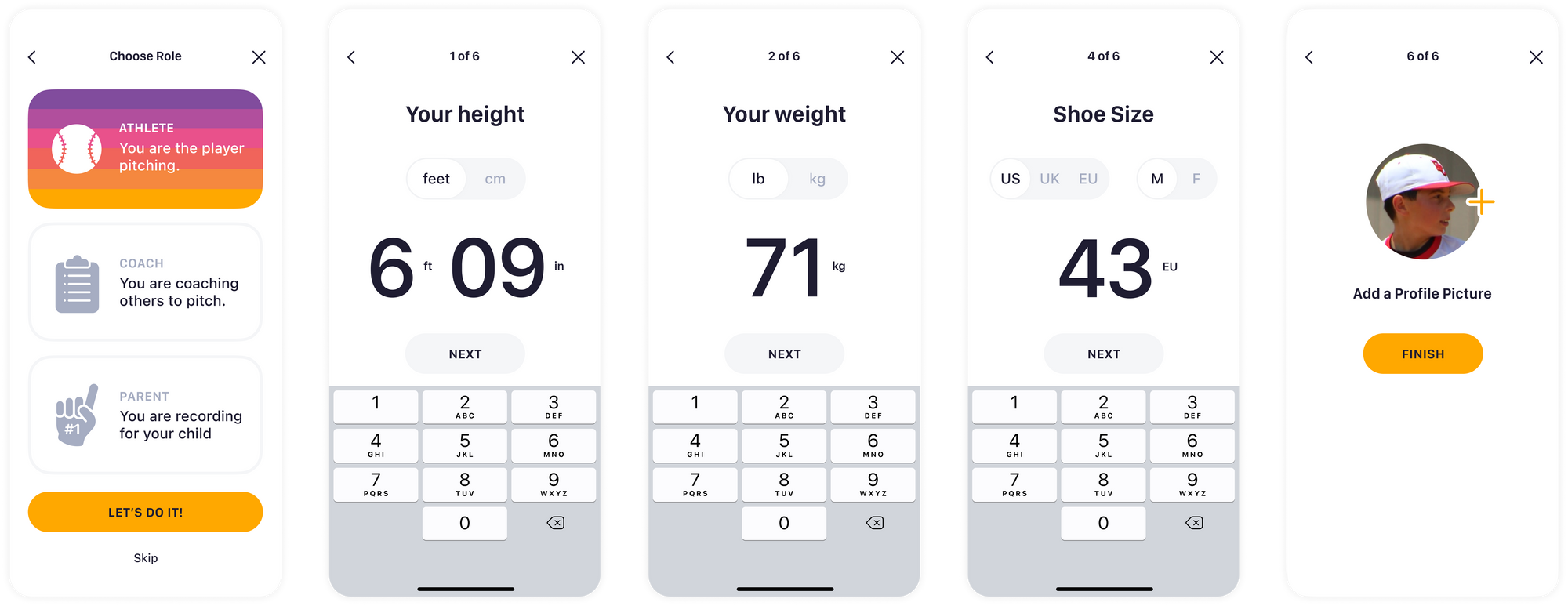
For Mustard, user measurements—height, weight, and shoe size—are crucial to the core functionality of the app. They use onboarding to collect all of this data, upfront.
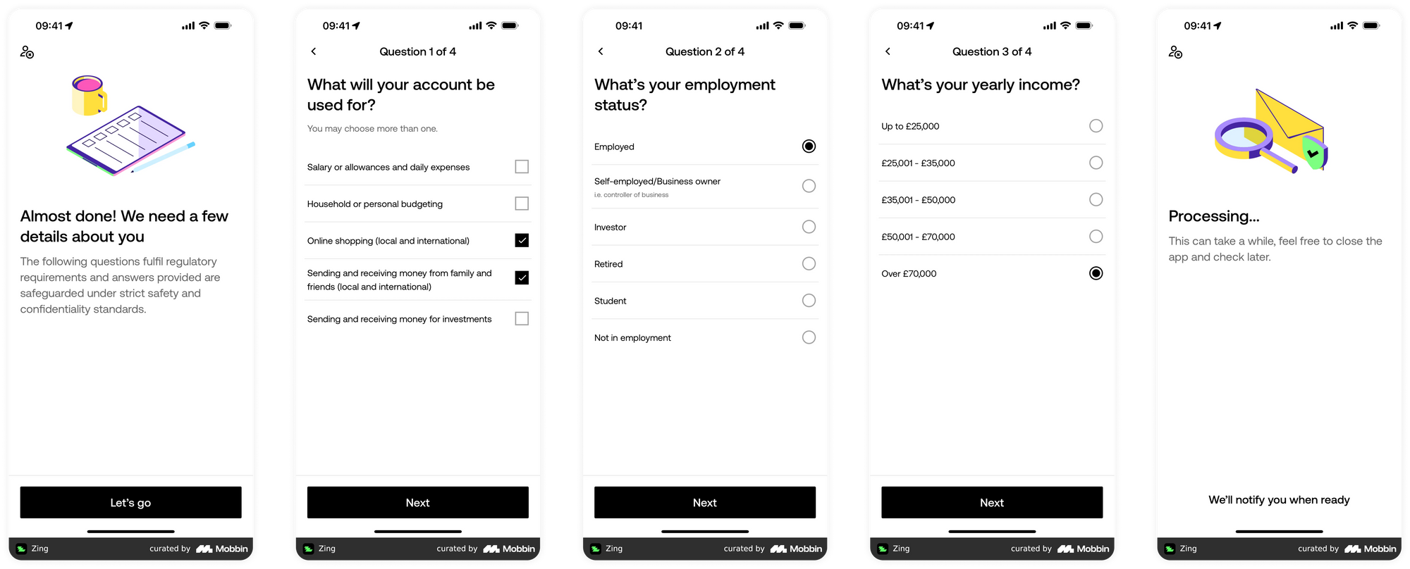
Money app, Zing, gathers financial data in order to follow regulatory requirements for their international money app.
How to collect
Once you know what to collect, you’ll need to decide how. Is it a single step process, or will there be several screens leading the user through the process? Have you created a UI that makes it easy for the user to understand what action to take? Can you use compelling visuals to help guide them through the process?
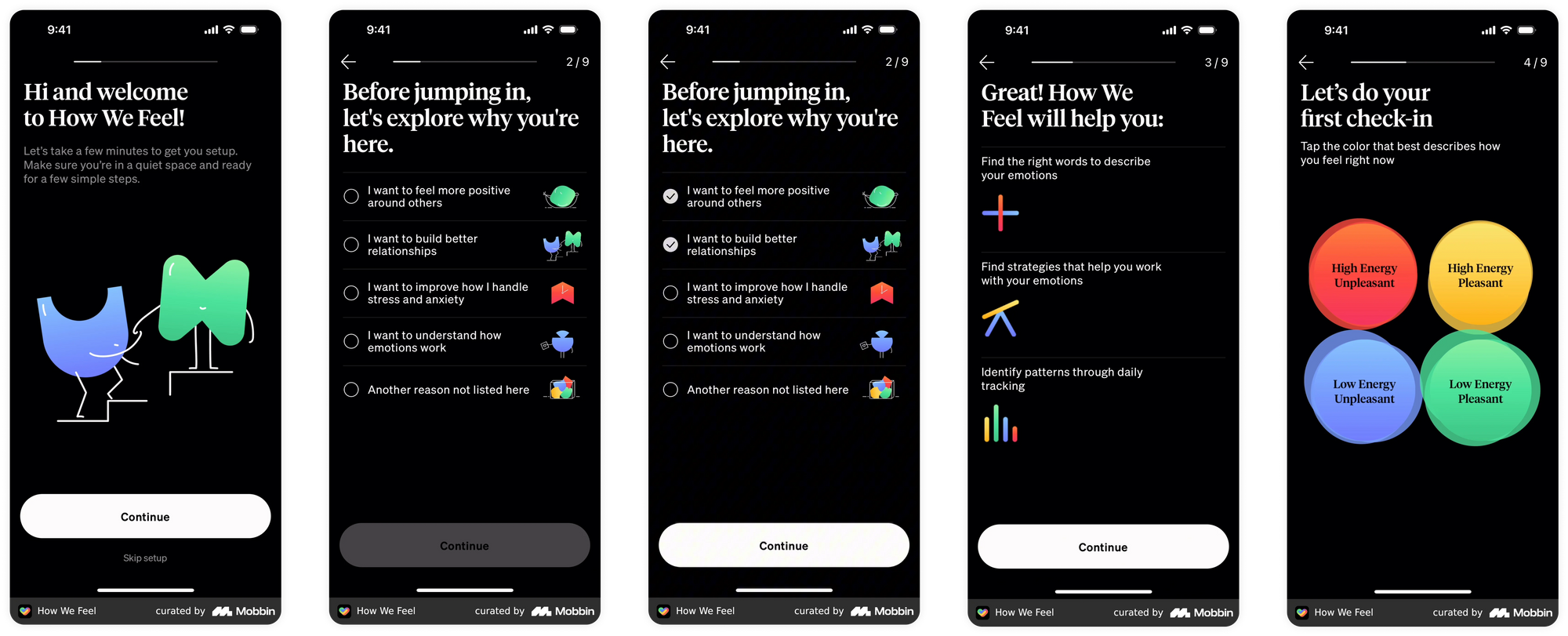
How We Feel, the app/well-being journal, uses iconography and color to guide users through a multiple-choice flow.
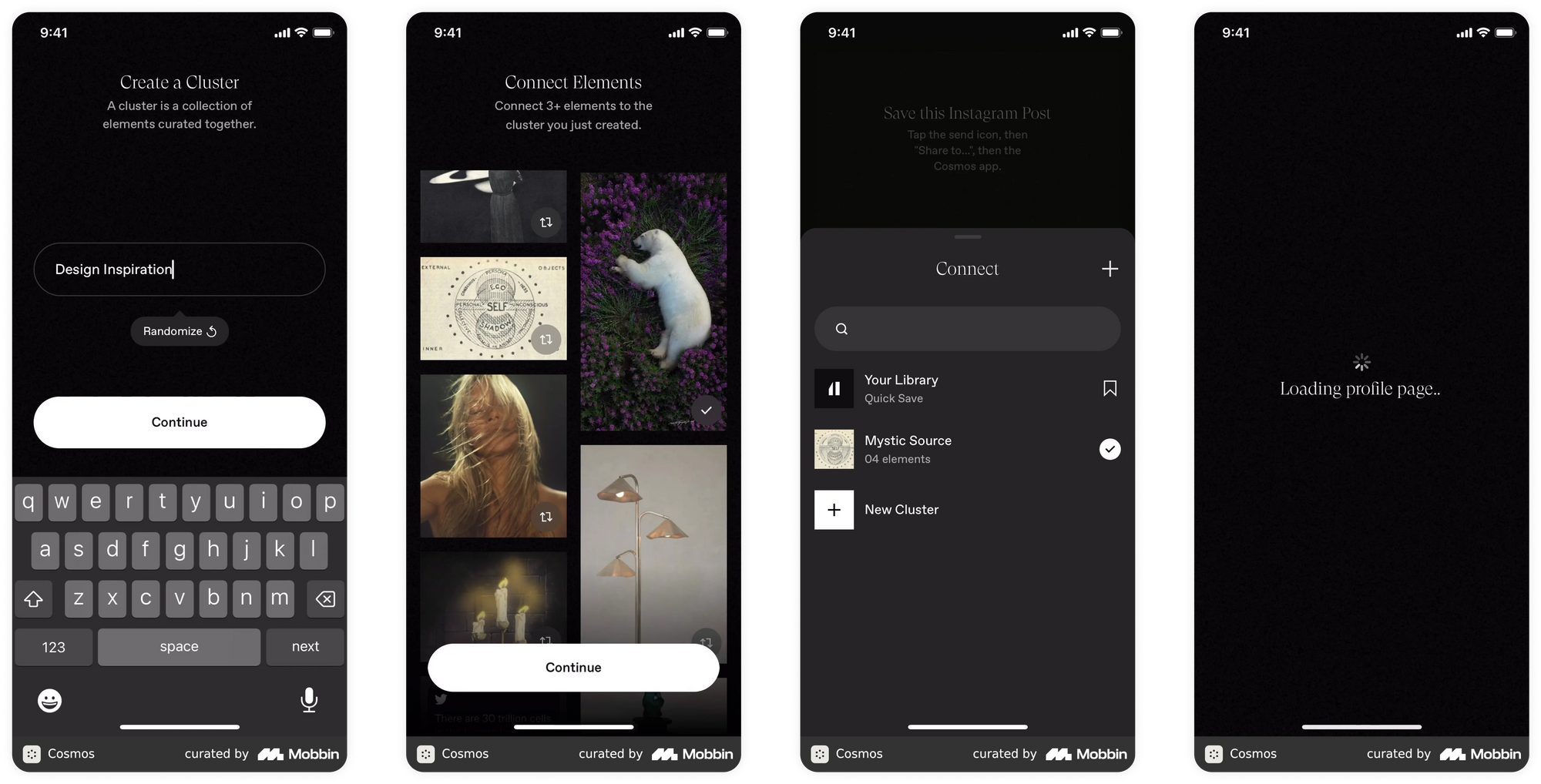
Cosmos, called “a discovery engine for creatives,” pushes users to create a cluster and populate it with inspirational imagery. This enables the app to create a customized profile page.
Need or want?
As with the other onboarding sections, you’ll want to decide where in the flow the customization and data capture occurs. Do you need to collect data right away (i.e., is it a necessary first step that can’t be avoided), or is it something that can be skipped? Other options to collecting data right away:
- Let the user experience the app so that the product can infer data and confirm it.
- Show the value of the product’s features, then send push/in-app messages to encourage the user to finish the data collection.
As a general rule of thumb, if it's not crucial to the app's success we would suggest removing it from onboarding so that the user can get into the product faster. Always keep user value top of mind.
Social Sign In & Authentication
Social Sign In is a great way to allow users to easily navigate through the sign-in process using multiple funnels. However, creating authentication options for your app requires additional development work, so don’t tread lightly here. Before you proceed, think carefully about the most valuable sign-in method for your target app audience.
Options for them, decisions for you
When deciding how many funnel options to present, think first about your users. Mobile-first users tend to have great conversion rates because they’re comfortable doing phone sign ups (OTP login) but what if your user base is older and used to Facebook or standard email/password logins? Give options that match these preferences whenever possible.
Remember: any new authentication method adds development and testing time. Once you add a new funnel, you’ll have to cater to those authentication types moving forward, so choose wisely.
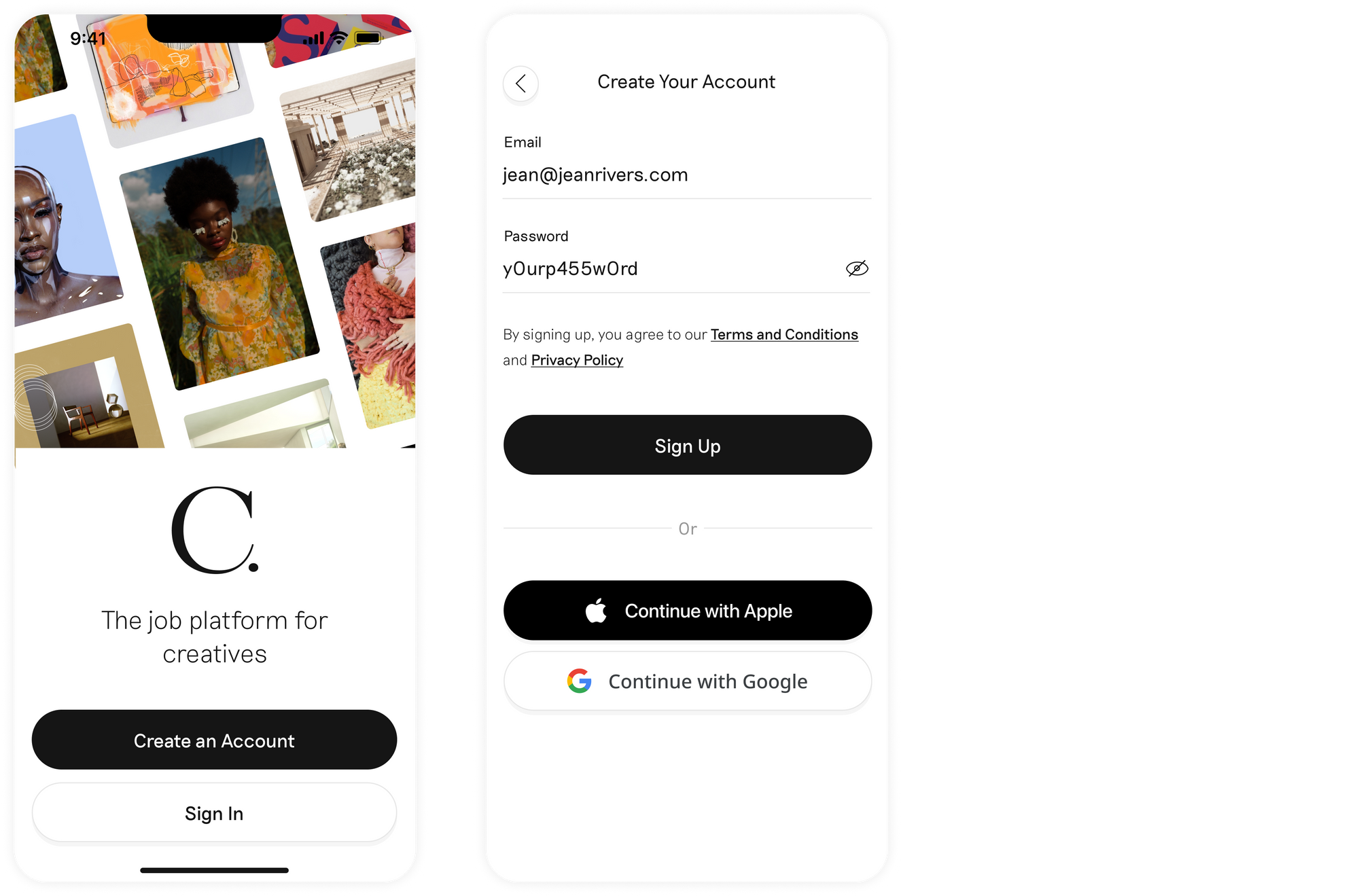
Job search app Creatively gives users options for native login, or through Apple and Google, but doesn’t include a Facebook option. Most likely not a priority method for its primary users.
Weight and see
No matter how many funnels you offer, you can give visual weight to your preferred sign-in options using branding, animation, even video.
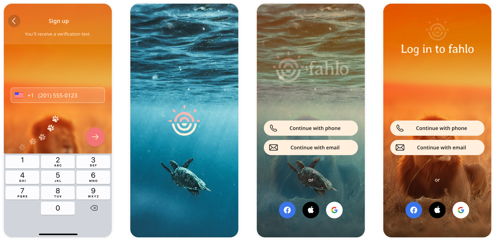
For the Fahlo app we used video and animation to accompany the sign-in flow. While we did provide options, we gave more visual weight to native sign in methods.
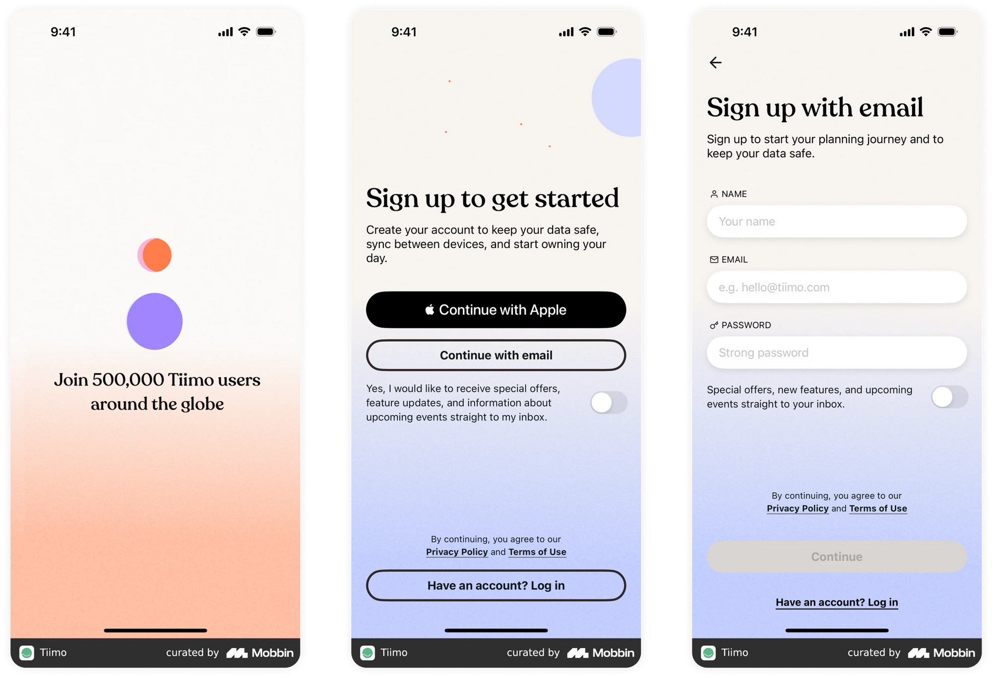
Tilmo, a daily planning app, gives visual weight to signing in via Apple. The other sign in button is demoted to the bottom of the page.
The how & when of verification
Once you’ve chosen your funnels you’ll need to decide how you’re going to handle verification. How will you authenticate your users before letting them continue, and where does verification happen in the onboarding process?
Some ways to verify:
- Travel app, Expedia, uses a code authentication process.
- Lime, the e-scooter provider, uses a toggle functionality to select multiple methods of verification - all of it outlined in a summary screen.
- Dating app, Bumble, uses a mobile verification code when using phone sign in
The buck starts at onboarding
While there's no one-size-fits-all solution for an effective onboarding, following the best practices outlined in this guide will help you design a flow that:
- Clearly communicates your app's value proposition
- Introduces features in a digestible way
- Strategically positions subscription offers
- Makes permissions requests feel natural and valuable
- Captures necessary user data
- Provides appropriate authentication options
Remember that onboarding is often your only chance to convert an interested user into an active one. Onboarding is part of your product that will likely always be evolving iteratively. Test different approaches, measure results, and iterate based on user behavior and feedback. With a thoughtful, well-designed onboarding experience, you'll be well positioned to turn curious users into long-term, engaged (and paying) customers.
Check out all our examples listed above in our comprehensive Figma guide here.
Need help auditing your existing onboarding or designing it for a new product? We can help. Contact Studio.
