
The Github repository with source code can be found here.
Create the Item Model
Start by creating the item model that represents each item on the list, including simple properties such as a title, color, and description.
struct Item: Hashable {
    let id = UUID()
    let title: String
    let color: Color
    let description: String
}
Set up the Initial View
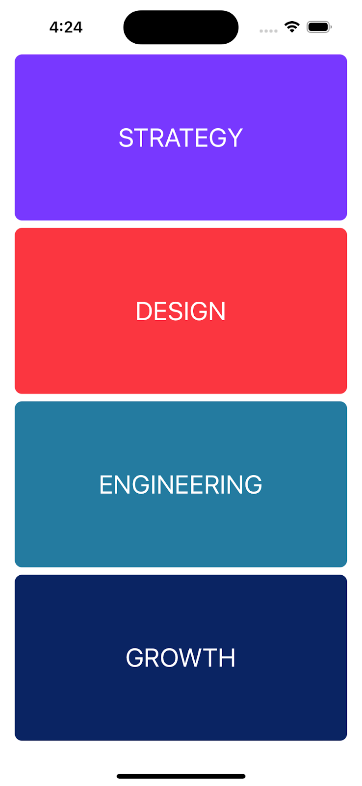
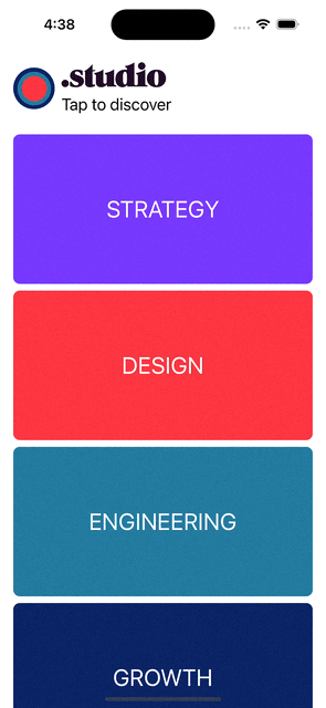
Next, let's create the initial view, which displays a list of items. Each item on the list will have a button that triggers the transition to a detailed view.
import SwiftUI

struct ContentView: View {

    var body: some View {
        VStack {
            ListView()
        }
    }
}

struct ListView: View {
    let items = [
        Item(title: "STRATEGY", color: Color("Purple"), description: "Solving problems and crafting solutions that make your business grow. \n\nWe make digital products, not just software, so we begin every project with Product Strategy Sprints to define problems, visualize solutions, and scope an Agile development plan."),
        Item(title: "DESIGN", color: Color("Red"), description: "Engaging users with beautiful design \n\nIn a crowded market, beautiful designs communicate to users how seriously you take their attention. In tandem with our product strategists, product designers work tirelessly to inspire users with original branding, human-centric experience design, and dynamic animations."),
        Item(title: "ENGINEERING", color: Color("MidBlue"), description: "Scaling your business with enterprise-class code\n\nThe Studio engineering teams translate our product designs into functional code on web, iOS, and Android. Whether you need a responsive web app or an iPhone application, our full-stack team will deliver documented, extensible code."),
        Item(title: "GROWTH", color: Color("DarkBlue"), description: "We think about growth as a diverse toolkit – not an individual channel.\n\nWe create and execute strategies to scale your company to the next level and define clear & measurable growth targets to keep team members aligned on the metrics that matter.")
    ]
    @State private var selectedItem: Item?

    var body: some View {
        VStack {
            ScrollView {
                ForEach(items, id: \.self) { item in
                    Button(action: {
                        withAnimation(.easeInOut) {
                            selectedItem = item
                        }
                    }) {
                        Text(item.title)
                            .matchedGeometryEffect(id: item.title, in: namespace, properties: .position)
                            .font(.title)
                            .foregroundColor(.white)
                            .frame(maxWidth: .infinity, minHeight: 180)
                            .background(
                                RoundedRectangle(cornerRadius: 8)
                                .fill(item.color)
                                .matchedGeometryEffect(id: item.color, in: namespace)
                            )
                            .padding(.horizontal)
                    }
                }
            }
        }
    }
}
Create the Detail View
Now, let's create the DetailView that displays the details of a selected item.
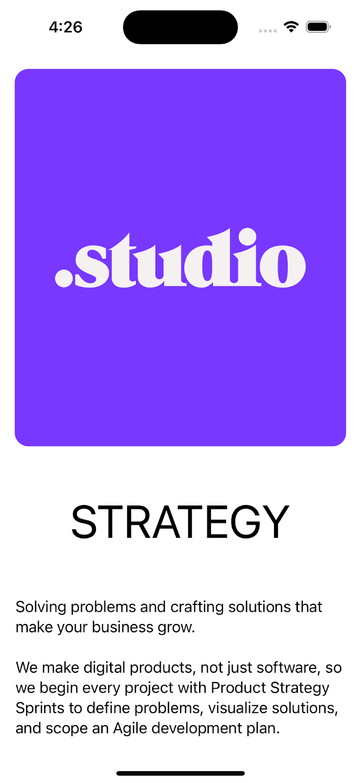
struct DetailView: View {
    let item: Item

    var body: some View {
        VStack(spacing: 20) {
            RoundedRectangle(cornerRadius: 15)
                .fill(item.color)
                .padding()
                .overlay(
                    Image("Studio Logo")
                    .resizable()
                    .aspectRatio(contentMode: .fit)
                    .frame(height: 65)
                )

            Text(item.title)
                .font(.system(size: 50))
                .padding()

            Text(item.description)
                .font(.body)
                .padding()
        }
        .cornerRadius(16)
    }
}
Add the Transition
Now that we have everything setup, we can implement the transition. To do this, we first need to add a @Namespace which is simply a view property that links views together.
struct ListView: View {
        ...
    @Namespace private var namespace
    @State private var selectedItem: Item?

    var body: some View {
        ...
    }
In the detail view, you need to add Namespace.ID which is a reference to the Namespace created in the parent view.
struct DetailView: View {
    let item: Item
    let namespace: Namespace.ID

    var body: some View {
        ...
    }
Once that’s done, add this modifier to all the views that should be part of the transition:
func matchedGeometryEffect<ID>(id: ID, in namespace: Namespace.ID, properties: MatchedGeometryProperties = .frame, anchor: UnitPoint = .center, isSource: Bool = true) -> some View where ID : HashableThe identifier should be unique allowing SwiftUI to transition between one layout and another.
One important thing to remember is to place all the modifiers that we want to include in the transition before the .matchedGeometryEffect(id: identifier, in: namespace)modifier. It is generally recommended to set the frame and padding modifiers after the matched geometry effect to ensure the desired behavior.
Apple does not provide detailed explanations for this, but it might be related to the way SwiftUI calculates positions and handles transitions.
By following this guideline, we can avoid any unexpected or unintended behavior during the animation.
struct ListView: View {
    let items = [
        Item(title: "STRATEGY", color: Color("Purple"), description: "Solving problems and crafting solutions that make your business grow. \n\nWe make digital products, not just software, so we begin every project with Product Strategy Sprints to define problems, visualize solutions, and scope an Agile development plan."),
        Item(title: "DESIGN", color: Color("Red"), description: "Engaging users with beautiful design \n\nIn a crowded market, beautiful designs communicate to users how seriously you take their attention. In tandem with our product strategists, product designers work tirelessly to inspire users with original branding, human-centric experience design, and dynamic animations."),
        Item(title: "ENGINEERING", color: Color("MidBlue"), description: "Scaling your business with enterprise-class code\n\nThe Studio engineering teams translate our product designs into functional code on web, iOS, and Android. Whether you need a responsive web app or an iPhone application, our full-stack team will deliver documented, extensible code."),
        Item(title: "GROWTH", color: Color("DarkBlue"), description: "We think about growth as a diverse toolkit – not an individual channel.\n\nWe create and execute strategies to scale your company to the next level and define clear & measurable growth targets to keep team members aligned on the metrics that matter.")
    ]
    @Namespace private var namespace
    @State private var selectedItem: Item?

    var body: some View {
        VStack {
            ScrollView {
                ForEach(items, id: \.self) { item in
                    Button(action: {
                        withAnimation(.easeInOut) {
                            selectedItem = item
                        }
                    }) {
                        Text(item.title)
                            .matchedGeometryEffect(id: item.title, in: namespace, properties: .position)
                            .font(.title)
                            .foregroundColor(.white)
                            .frame(maxWidth: .infinity, minHeight: 180)
                            .background(
                                RoundedRectangle(cornerRadius: 8)
                                .fill(item.color)
                                .matchedGeometryEffect(id: item.color, in: namespace)
                            )
                            .padding(.horizontal)
                    }
                }
            }
        }.overlay {
            if let selectedItem {
                DetailView(item: selectedItem, namespace: namespace)
                    .frame(maxWidth: .infinity, maxHeight: .infinity)
                    .background(Color.white)
                    .onTapGesture {
                        withAnimation(.spring()) {
                            self.selectedItem = nil
                        }
                    }
            }
        }
    }
}

struct DetailView: View {
    let item: Item
    let namespace: Namespace.ID

    var body: some View {
        VStack(spacing: 20) {
            RoundedRectangle(cornerRadius: 15)
                .fill(item.color)
                .matchedGeometryEffect(id: item.color, in: namespace)
                .padding()
                .overlay(
                    Image("Studio Logo")
                    .resizable()
                    .aspectRatio(contentMode: .fit)
                    .frame(height: 65)
                )

            Text(item.title)
                .matchedGeometryEffect(id: item.title, in: namespace, properties: .position)
                .font(.system(size: 50))
                .padding()

            Text(item.description)
                .font(.body)
                .padding()
        }
        .cornerRadius(16)
    }
}

struct DetailView_Previews: PreviewProvider {
    @Namespace static var namespace

    static var previews: some View {
        DetailView(item: Item(title: "STRATEGY", color: Color("Purple"), description: "Solving problems and crafting solutions that make your business grow. \n\nWe make digital products, not just software, so we begin every project with Product Strategy Sprints to define problems, visualize solutions, and scope an Agile development plan."), namespace: namespace)
    }
}
You might have noticed that we are using .matchedGeometryEffect(...properties:.position). We tell SwiftUI to copy the position from the source view so as to prevent the text from being truncated during the animation.
Once an item is selected, we hide the list to display its detail view. SwiftUI will now make a spring animation as defined in the onTapGesture.
Swipe to dismiss
For a nicer user experience, we will add a swipe to dismiss gesture to go back to the list of items.
To make this reusable, we can create a ViewModifier that can be applied to any view.
struct SwipeToDismissModifier: ViewModifier {

    @State private var offset: CGSize = .zero
    var onDismiss: () -> Void

    func body(content: Content) -> some View {
        content
            .offset(y: offset.height)
            .animation(.interactiveSpring(), value: offset)
            .simultaneousGesture(
                DragGesture()
                    .onChanged { gesture in
                        offset = gesture.translation
                    }
                    .onEnded { _ in
                        if abs(offset.height) > 100 {
                            onDismiss()
                        } else {
                            offset = .zero
                        }
                    }
            )
    }
}
The modifier has the following properties:
offset: A state property that represents the current offset of the view. It starts with zero size and gets updated as the user interacts with the view.
onDismiss: A closure that will be called when the view is dismissed.
The content view is offset vertically by the offset.height value, which creates the visual effect of moving the view based on the user's gesture.
An animation is applied to the offset property to provide a smooth interactive experience. The animation is triggered whenever the offset value changes.
The simultaneousGesture modifier is used to attach a DragGesture to the content view. This gesture allows the user to interact with the view by dragging it.
When dragged, the view updates the offset property with the translation of the gesture, allowing the view to follow the user's finger. When the user stops dragging, onEnded is called and checks if the value of the vertical offset (offset.height) exceeds a threshold value (100 in this case). If it does, the onDismiss closure is called to perform the dismissal action. Otherwise, the offset is reset to zero, bringing the view back to its original position.
We then create an extension to use it in an elegant way:
extension View {
    func swipeToDismiss(onDismiss: @escaping () -> Void) -> some View {
        modifier(SwipeToDismissModifier(onDismiss: onDismiss))
    }
}
Finally, apply the modifier to the DetailView.
DetailView(item: selectedItem, namespace: namespace)
    .frame(maxWidth: .infinity, maxHeight: .infinity)
    .background(Color.white)
    .swipeToDismiss {
        withAnimation(.spring()) {
            self.selectedItem = nil
        }
    }
Layout transition
Expandable header
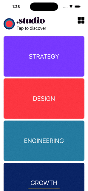
To demonstrate another way to use matchedGeometryEffect, let's add an expandable header to our list.
We simply create 2 layouts - one horizontal and one vertical - and use matchedGeometryEffect on the icon and the title for the expanded and retracted view so SwiftUI knows how to transition between the two view states.
var retractedHeader: some View {
        HStack {
            Image(systemName: "star.circle")
                .font(.system(size: 50))
                .matchedGeometryEffect(id: "icon", in: namespace)

            VStack(alignment: .leading) {
                Text("Item list")
                    .font(.system(size: 30))
                    .matchedGeometryEffect(id: "title", in: namespace)

                Text("Tap to read more")
                    .font(.system(size: 20))
            }

            Spacer()
        }
        .onTapGesture {
            withAnimation(.easeOut) {
                isHeaderExtended.toggle()
            }
        }
        .padding()
    }

    var extendedHeader: some View {
        VStack {
            Image(systemName: "star.circle")
                .font(.system(size: 100))
                .matchedGeometryEffect(id: "icon", in: namespace)

            Text("Item list")
                .font(.system(size: 40))
                .matchedGeometryEffect(id: "title", in: namespace)

            Text("Lorem ipsum dolor sit amet, consectetur adipiscing elit. Fusce non nibh varius odio auctor blandit. Quisque sollicitudin massa justo. Fusce consequat erat ac quam lobortis finibus. Pellentesque lorem lacus, mattis id aliquet a, dapibus et lorem. Integer ultrices pellentesque purus, non iaculis nisi consequat eu.")
                .font(.system(size: 15))

        }
        .onTapGesture {
            withAnimation(.easeIn) {
                isHeaderExtended.toggle()
            }
        }
        .padding()
    }
struct ListView: View {
//...
@State private var isHeaderExpended: Bool = false
var body: some View {
//...
if isHeaderExpended {
extendedHeader
} else {
retractedHeader
}
ScrollView {
//...
}
}
}Grid layout
Similarly, we can add a button to switch from a vertical layout to a grid layout.
@State private var isGridLayout: Bool = false

var body: some View {
    //Header

    VStack {
        ScrollView {
            if isGridLayout {
                gridLayout
            } else {
                // Vertical Layout
            }
        }
    }
    .overlay {
        VStack {
            HStack {
                Spacer()
                Button(action: {
                    withAnimation {
                        isGridLayout.toggle()
                    }
                }, label: {
                    Image(systemName: isGridLayout ? "rectangle.grid.1x2.fill" : "square.grid.2x2.fill")
                            .resizable()
                            .foregroundColor(.black)
                            .frame(width: 30, height: 30)
                })
            }
            .padding(.top)
            .padding(.trailing)
            Spacer()
        }
    }
}

private var gridLayout: some View {
        LazyVGrid(columns: [GridItem(.flexible()), GridItem(.flexible())]) {
            ForEach(items, id: \.self) { item in
                Button(action: {
                    withAnimation(.easeInOut) {
                        selectedItem = item
                    }
                }) {
                    Text(item.title)
                        .matchedGeometryEffect(id: item.title, in: namespace, properties: .position)
                        .font(.title2)
                        .foregroundColor(.white)
                        .frame(maxWidth: 300, minHeight: 330)
                        .background(
                            RoundedRectangle(cornerRadius: 8)
                            .fill(item.color)
                            .matchedGeometryEffect(id: item.color, in: namespace)
                        )
                }
            }
        }
        .padding(.horizontal)
    }
The code is pretty straight forward. A simple boolean is used to change between the grid and each layout.
To ensure the button remains visible above the expandable header, overlay the button on the content VStack.
The same item, with the same matchedGeometryEffect, is used except we change its dimensions to fit two items per row.
Conclusion
Animations are a great way to bring life and smoothness to iOS apps.
Using @Namespace property wrapper to link views together and create a smooth animation when transitioning between them. By applying the matchedGeometryEffect modifier, we ensured that the transitioning views maintained their position, color, and other properties, resulting in a seamless user experience. Additionally, we implemented a swipe-to-dismiss gesture using a custom ViewModifier to enhance the interaction and allow users to easily navigate back to the previous screen. Furthermore, we demonstrated the versatility of matchedGeometryEffect by incorporating an expandable header in the list view, showcasing another way to leverage this powerful feature. With these techniques, you can create visually appealing and interactive interfaces in your SwiftUI applications.