“I’m not sure that if you put a button that said ‘free cupcake’ that it would get more clicks than ‘skip intro’.”
An anonymous Netflix engineer
There is a generation that remembers the exact moment mankind landed on the moon.
There is a generation that remembers the exact moment they first heard about Terminator 2: Judgment Day and how it made all other action movies obsolete.
For many people in app design, this moment was the first time they saw (and then immediately clicked) Netflix’s Skip Intro button.
It was the epitome of a tiny, laser-focused thing that made a huge difference, especially considering the fact that Game of Thrones was at the height of its popularity, complete with its (in)famously long opening credits.
It wasn’t Skip 10/20 seconds ahead, and it wasn’t one of their alternatives, such as Jump Past Credits, Skip Credits, or Jump Ahead, which they tested before settling on the winner.
It was Skip Intro. The winner.
Why start with this story?
Because it perfectly and very succinctly exemplifies so many best practices for app design. Not all of them, but many of them.
1. Validate Assumptions
As Cameron Johnson shares in his story about the Skip Intro button [1], he personally manually skipped the opening credits of Game of Thrones, often overshooting it or having to listen to the last few bars of the (undoubtedly great) score.
Someone less experienced would immediately assume that this is a problem a person in their position (Director of Product Innovation) should solve. However, great app design is not built on assumptions. It is built on validating those assumptions before you act on them.
Mr. Johnson knew that, so he and his team started looking at the data. They discovered that more than 15% of Netflix users skip ahead within the first five minutes of an episode of GoT. The only explanation for this relatively high portion of users skipping ahead so early was that they were skipping the intro.
Assumption validated.
Another great example of this is a proposed addition to the LinkedIn Recruiter Tool by Evelyn Rasmussen [2], a design manager at Intuit.
Her proposed addition would enable recruiters to send targeted and personalized messages to “passive candidates”, people who are not actively looking for a new job, but who wouldn’t immediately say no to a possibility. Her assumption when designing this feature was that passive candidates would best be approached by addressing their personal motivations or even “dreams.”
So, what did Evelyn do?
She did a stunning amount of research for what is, basically, just an exercise. She not only scoured recruiting reports, publications and blogs, but actually went and interviewed seven passive candidates, one active candidate, three recruiters, and one hiring manager to confirm her assumption.
Their answers told her she was right.
Assumption validated.
Just because you assume something about your web or mobile app design or even if your “friends and family” validate it, this does not mean that the wider user base would agree.
Do your research. Analyze data. Validate beyond people around you.
2. Test Everything
Back to the Skip Intro story.
Namely, once they confirmed their assumption and actually built the functionality, Mr. Johnson’s team wanted to make sure they named the new button optimally. Seems like a minor concern, right?
Not for a team of that caliber. Teams like that understand that everything needs to be tested, even the copy on that one button.
We already mentioned their other alternatives – Jump Past Credits, Skip Credits, Skip, and Jump Ahead.
Looking at the options, one might assume (see above) that Skip Credits would perform best. It literally says what the button does – it skips credits.
However, they still decided to test it on 250 shows.
Skip Intro won.
Perhaps it was more understandable for people with limited knowledge of the English language who were unfamiliar with the term credits? Perhaps it just looks better?
Who knows.
That is why you test stuff.
You do not waste weeks or months before you look back to see if your design choice was the right one. You test asap.
When we did the QVC mobile app, we tested extensively even though, collectively, we have worked on innumerable shopping apps and know all about mobile app design best practices.
Take a look at our work and see best practices being, well, put into practice.
3. Iterate, Iterate, Iterate
One of the most common mistakes in app design is tightly connected to the previous part of the article and usually occurs when the design is just part of the app development process. Namely, in such situations, even if the product development team does actual development iteratively, the design is too often assigned a single sprint, and once done, it’s locked in.
Take it and run with it!
The worst thing is that this approach is equally as maddening for the design team as it is for the developers. Both teams end up backtracking incessantly, trying to fix something (and dozens more somethings caused by the initial something) that could’ve been avoided by treating app design iteratively, too.
Almost every step of the app design process needs to be approached iteratively and tested along the way if you want to ensure your application will end up as something people will actually use and come back to – user persona creation, information architecture, wireframing, prototyping, UI design, user flow design, visual design.
There are so many ways in which you can mess up any of these and not realize it until it’s very (too) late.
In such situations, late is a synonym for costly.
A great example of iterating your app design is provided in this case study by Finna Wang [3], now a user experience designer at CarGurus. And it’s not even just about avoiding mistakes. It is also about coming up with new ways to improve the app design as you get feedback and collect insights from test users.
This is why, here at Studio, we see the MVP as an approach to identifying a market opportunity in the fastest way possible and not as version 1.0 of the product. This allows us to treat design iteratively as much as engineering.
Build with us and see what a difference that makes.
4. Recognize the Aha! Moments
The Aha! moments from the heading above are what app designers live for, they are those magical moments when we realize that we’ve made a discovery that will make the app something people will come back to over and over again.
Studio had one such moment when we were doing the mobile app design for Mustard, a baseball coaching app.
Our Aha! moment was initially an assumption. Namely, we hypothesized that the pitch analysis functionality was the retention driver for the app.
However, we did not stop at the assumption.
We pulled up our sleeves and started digging through the analytics to try and validate it. We soon confirmed that engagement and subsequent use of the app went through the roof for users who viewed their report cards.
The Aha! moment was real.
From there on, it was just a matter of influencing the users to develop a digital analog of the routine of stepping into a bullpen with their coach.
However, you never know when these moments will happen. Sometimes, they come from testing the user journey or doing competitive analysis. Other times, they might come when you watch the test users actually interacting with the app design. They might also come from the heat map of the MVP.
The important thing is that you know how to recognize those moments.
Perhaps you’ll be lucky enough that they are obvious – like in the case of observing test user behavior or analyzing the feature usage. Other times, they might be more assumptive and less in-your-face.
But that is why you test and iterate.
5. Talk to People
There is no 'art for art's sake' in app design and development. Apps should never be designed just so they are the most beautiful or even the most useful apps.
They are built to solve a problem (sometimes more than one) that people have.
Another way to put this: People do not want your product. They want something your product does.
There is no analytical tool for this. Sometimes, even a quantitative survey won’t cut it. The only way to know you are building a design and an app that people want is to talk to people. A lot of people. For one, if you are a mobile and web app design agency and you have a prospective client, you have a professional moral responsibility to engage them in a difficult conversation about why you wish to build an app.
Is it an assumption? Has it been validated beyond “friends and family”?
Is it an idea that revolves around what the app does, or is it an idea about what people will use it for?
These are tricky questions, both for you to ask and for the prospective client to answer. Sometimes, the truth is not what people want to hear.
Once the project is up and running, there are even more people to talk to, most notably test users and the people who fit the persona(s) you’ve built to represent the future users of the app.
We saw how Evelyn conducted interviews for the LinkedIn feature suggestion.
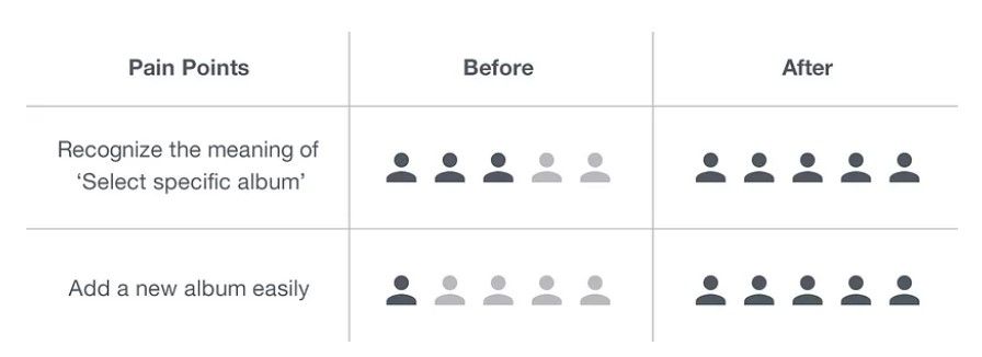
A great example of how to “talk” to test users through surveys can be found in this UX case study & design process [4] for an album and image-sorting application by Seoul-based digital product designer Hyouk Seo. In the section Pain Points, he talks about the main issues the users came across when testing out the initial wireframe.
He ‘talked’ to test users until he perfected his app design.
Of course, the ideal is for you to sit in the same room with test users and talk to them as they tinker with your design. This is where pure gold can be found, a real treasure trove of aha! moments.
Just talk to people. It is a part of your job as an app designer.
6. Do the Basics Right
We wanted the app design best practices in this article to be mostly high-level ones, those that point you in the right direction and ensure you’re not wasting anyone’s time. Also, we didn’t want it to be yet another one of those “1. declutter, 2. use predictive text, 3. make design consistent” articles - there are already more of those out there than the world needs.
However, we would feel remiss not to at least give you a list of the basics to keep in mind, just in case. So:
1. Declutter
2. Use predictive text
3. Make design consistent
4. Make error messages clear
5. Minimize user effort
6. Use common screens
7. Avoid non-standard jargon
8. Stick with a navigation pattern you choose
9. Avoid sign-in gymnastics
10. Make your app fast and responsive
11. And so on…
Conclusion
As you’ve probably realized by now, the majority of high-level best practices for professional web and mobile app design are based purely on common sense. One might say obvious.Unfortunately, and this is something we encounter every day, obvious tends to get overlooked. Hopefully, this article will help you remember them the next time you start working on the next big thing.