According to Statista’s research, around 42% of users abandon websites if they encounter poor functionality or usability issues 1.
In other words, if you have 1000 weekly visitors, your UI/UX issues may be costing you 420 closed deals. High bounce rates, low conversion rates, and abandoned sign-ups may all be indicators of poor UX. Spending time on an audit can unearth the “why” behind this data and illuminate other UI/UX flaws that your team can improve on.
If you don’t know where to start, this guide will show you why, when, and how to do a UI/UX audit and effectively caulk the cracks that customers are slipping through.
3 Steps to a Complete UX Audit
1. Decide when to perform a UI/UX audit
The biggest reason for conducting a UI/UX audit is when the team notices a drop in sales, conversions or user engagement. These are the KPIs (key performance indicators) that will indicate when it is crucial to act.
Keep in mind that the design may not be the only issue with your website or app, but it is worth investigating since even the slightest change in design can have a ripple effect on your website/app performance. UI/UX health checks can be especially helpful prior to a big feature launch or product update, as they will illuminate pain points, unmet user needs, and help your team discover urgent issues.
Here are a few things to keep in mind:
- Decide on SMART goals: With clear objectives and goals, you will narrow down the test case studies and determine what specific data to focus on. For example, if you want to minimize cart abandonment rates, then you will focus on the specific actions users take right after they’ve failed to make a purchase. Making too many decisions at once can be detrimental, as you will not have a narrow enough test to understand what is working in new designs and what should evolve.
- Know the essence of past design decisions: Collaborate with design, engineering, and marketing teams to understand the goals behind past design decisions to measure if they match current user intent and behavior.
- Gather data: Analyze how users are behaving in the segment you are testing and auditing. We will elaborate on the tools and steps below.
- Look at competitors: Drawing references on design patterns or UX decisions made by direct competitors or those adjacent to your industry can be a helpful research step.
- Set up an endpoint: The UI/UX audit can go on forever unless you have a clear endpoint that will signal the end of the analysis. For example, you will analyze 100 user activities before making any design hypotheses and recommendations.
- Understand your users: Dig deep into user personas to understand their points of view, pain points and desired outcomes. Look into customer documentation or conduct interviews to get an objective overview of potential misalignments.
- Map out their journey: Based on the research, map out how the activity you are testing (for example, users putting items in the cart and purchasing them) should look from the users' point of view, and then compare with the actual behavior.
2. Set up your tools
To objectively monitor customer behavior, you will need analytics and behavior tools. Customer interviews are a fantastic way to get a better understanding of users’ expectations, but they are time-consuming and difficult to scale. Cold, hard data helps reveal patterns and concrete UI/UX changes that should be made.
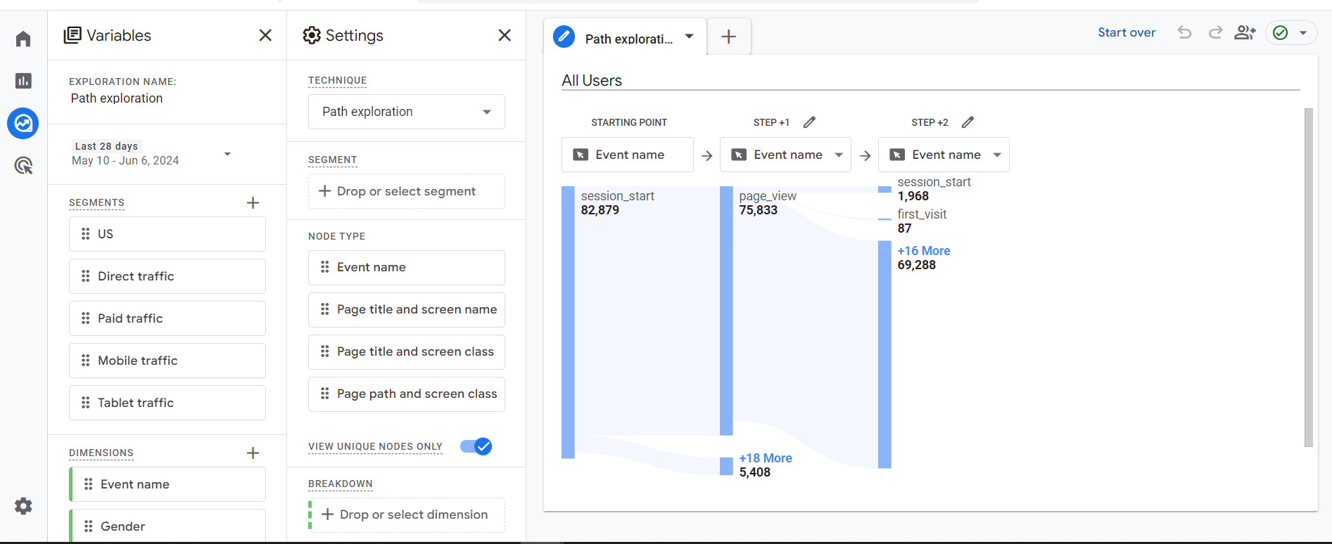
A traditional analytics tool that will reveal your customer's journey in a nutshell is Google Analytics 4 (GA4). The feature “Path Exploration” will give you more insights into your user journey.
In the Path Exploration tab, you can choose an event or page and track how users get to it. You can figure out the:
- User start and end point
- Page path that leads to conversions
- User navigation through the website
- Top performing pages
GA4 gives you a glimpse into user behavior, but for a proper UI/UX audit, you will need a user behavior tool. Essentially, GA4 can help you answer WHO your users are and WHAT they do, while a user behavior tool will answer WHY they do certain actions and HOW they do it.
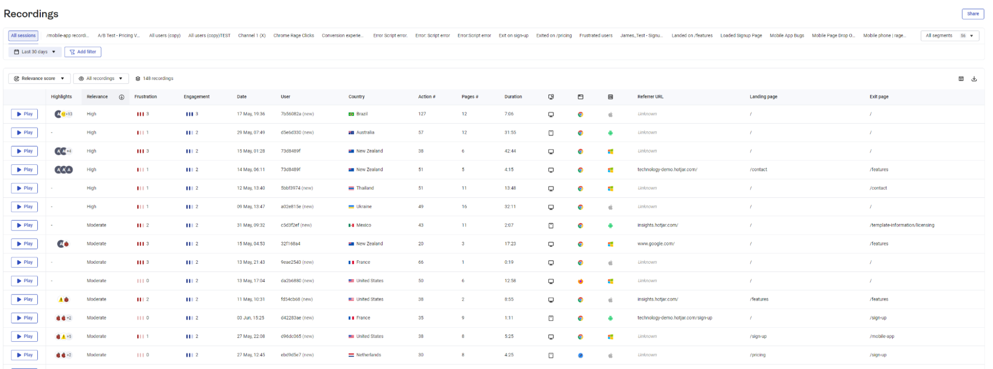
Therefore, to get the full picture, you need to install a behavior analysis tool such as Hotjar, Kissmetrics, or CrazyEgg. We will use Hotjar in this guide since they have a free plan for up to 35 sessions.
Hotjar is a customer experience insights tool that tracks user behavior across your platform. With it, you can monitor how your users are interacting with design elements to find out what they click on most, what they avoid, and what steps they take to find what they are looking for.
With the recordings of their screen movements, you get a visual representation of their navigation and experience with your platform.

Set up Hotjar’s tracker on your website/app and record user sessions. It will monitor, track and record how users interact and navigate with your website/app. You can analyze where users drop off (Funnel’s tool), filter specific actions such as “abandoning carts” (Hotjar Events tool) or specific customer personas such as “filtering by roles or spend amount” (User Attributes).
Once you’ve reached your desired number of recordings, you can analyze the data for the segments you’ve outlined in the first step of the UI/UX audit.
If you want a full and comprehensive UI/UX audit that will reveal every scenario and segment where users encounter problems, make sure to upgrade to a higher plan and lock in a month or two (depending on the user base and the complexity of your app/website).
3. Follow our ultimate UI/UX audit checklist
Before reviewing your recordings, map out the specific patterns and activities you will look into. You can follow this UI/UX audit checklist:
Once you’ve identified issues and patterns from activities that drive away customers, it is time to define and rank them by urgency. This will help prioritize post-audit activities and create hypotheses for UX improvements. These hypotheses should be backed up with data, outline the desired outcome, and be testable.
After sorting your findings and developing clear and concise UX improvements, the next step is to share them with the design team. Once implemented, keep tracking user behavior to see how they react to new changes. If some issues have multiple design solutions or paths to take, the best option would be to do an A/B test and see what users interact better with.
UI/UX Design Examples for Better User Experience
Here are some potential design ideas that help users easily navigate through the site and streamline their customer journey.
John Lewis
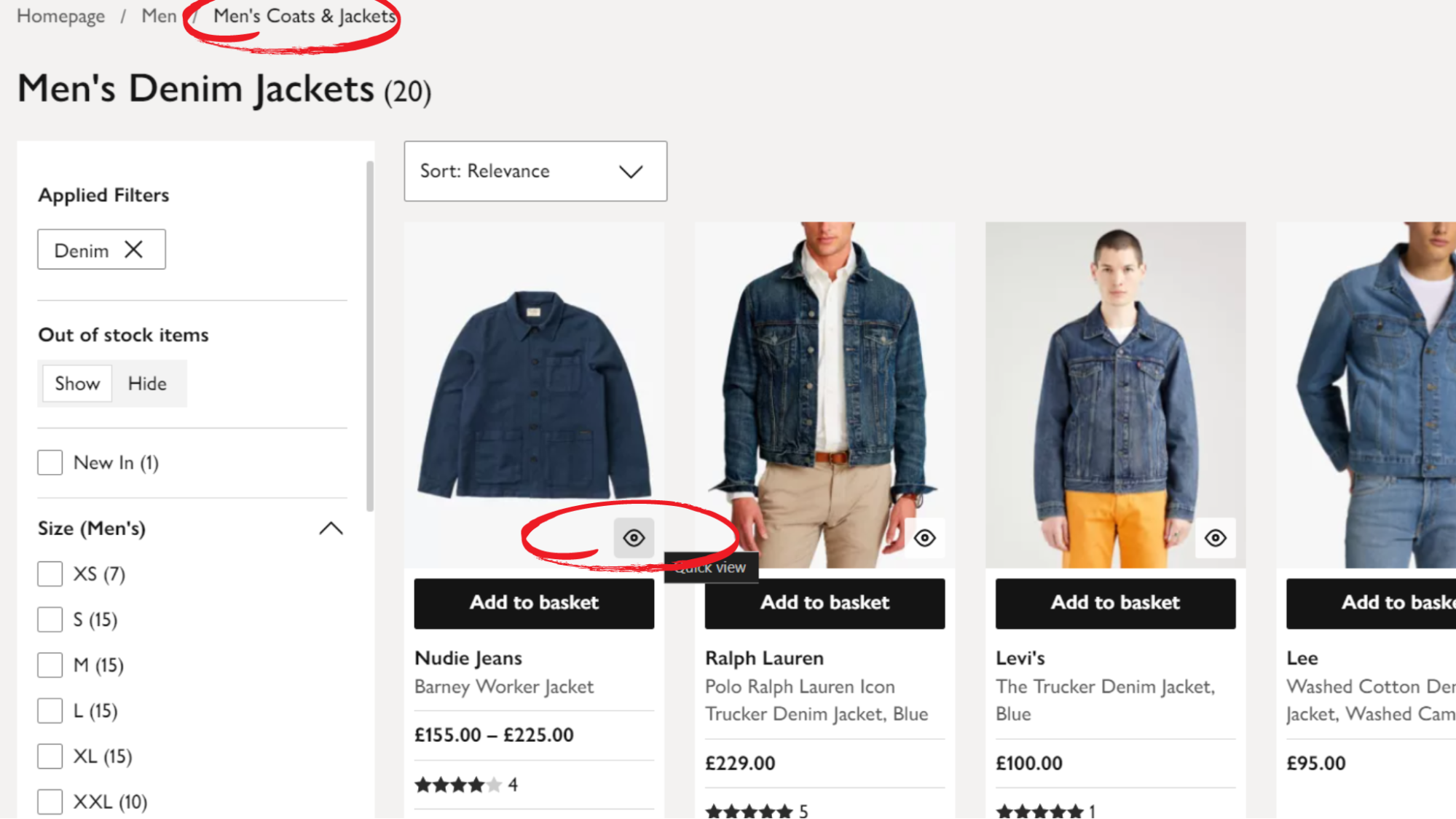
John Lewis is a good example of how to make it easy for customers to understand the context behind their search results. They simplified how a user can navigate categories and find what they are looking for by keeping the filters they’ve applied both in the upper and side navigation at all times.
They also added the“quick view” option, where users can take a quick glance at all the necessary information for one item. Some webshops make you go to a separate page, which requires more effort from the user to come back to the original page.
Source: https://www.johnlewis.com/
Apple Store
Apple’s webshop is based on a minimalistic design, but packed with value and great user experience.
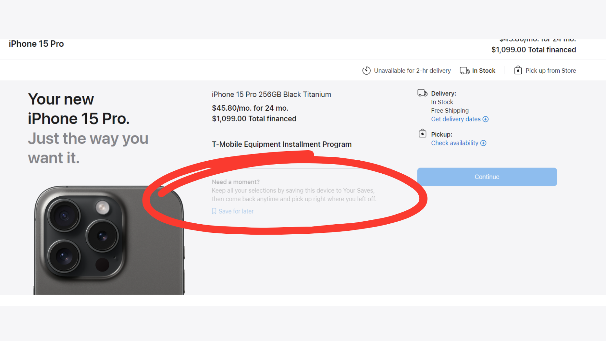
In every step of the customer journey, Apple’s design team provides options for those who need more assistance. Their “Need help choosing the model?” button directly leads the user to a lengthy comparison that may clear all their doubts.
Another idea to potentially avoid high cart abandonment rates is to offer users a delayed decision option. As seen on Apple’s website, potential buyers can save their cart and come back later while Apple reminds them that they have “unfinished business.”
This little feature can have a great impact on those who plan to abandon their cart since they will have a reminder to come and continue where they left off.
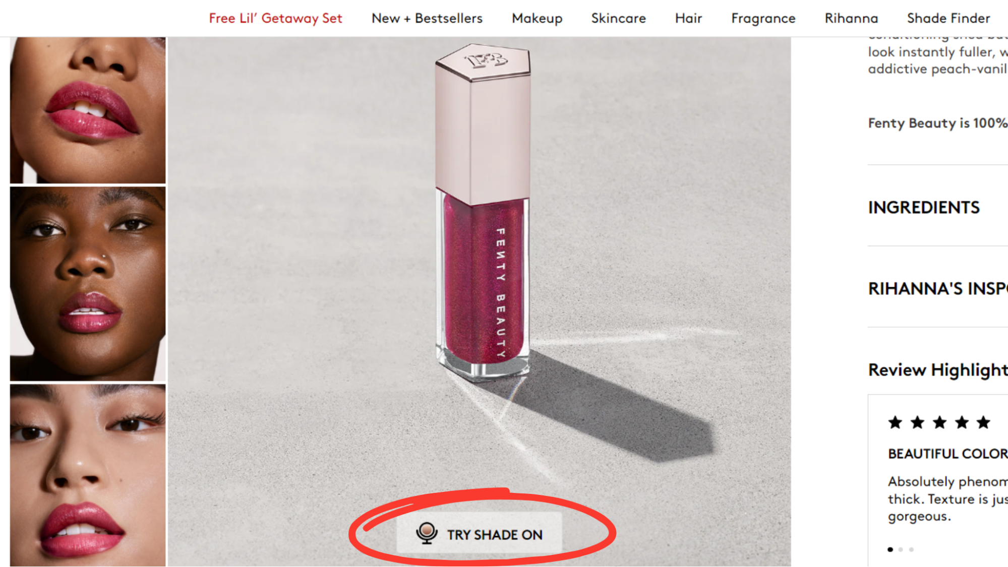
Fenty Beauty
A great example of directly answering customer needs and pain points is Fenty Beauty’s design. The main pain point of buying makeup on the internet is not knowing if it will suit you well.
Before they introduced a solution to this problem, most beauty products were sold on a trust basis (not knowing if the customer would be satisfied with the end result). However, the Fenty Beauty team increased their online sales and boosted customer satisfaction by introducing the “Try Shade On” feature.
This feature helps indecisive customers find out if the product is the right fit for them with a simple click.
Mustard
We’ll end this section with one of our finest UX/UI moments that came when we were doing the Mustard mobile app for baseball training.
We hypothesized that the pitch analysis feature was the key retention driver for the app. To validate this, we delved into the analytics and soon confirmed that user engagement and continued use skyrocketed for those who viewed their report cards.
From there, it was about encouraging users to replicate the routine of stepping into a bullpen with their coach in a digital format. Our design team did this by recreating this real-life scenario digitally, reflecting the moment student-athletes step into a bullpen with their coach.
This ceremonial pitching session allows athletes to test their weekly progress and understand how it influences drill recommendations and progression plans.
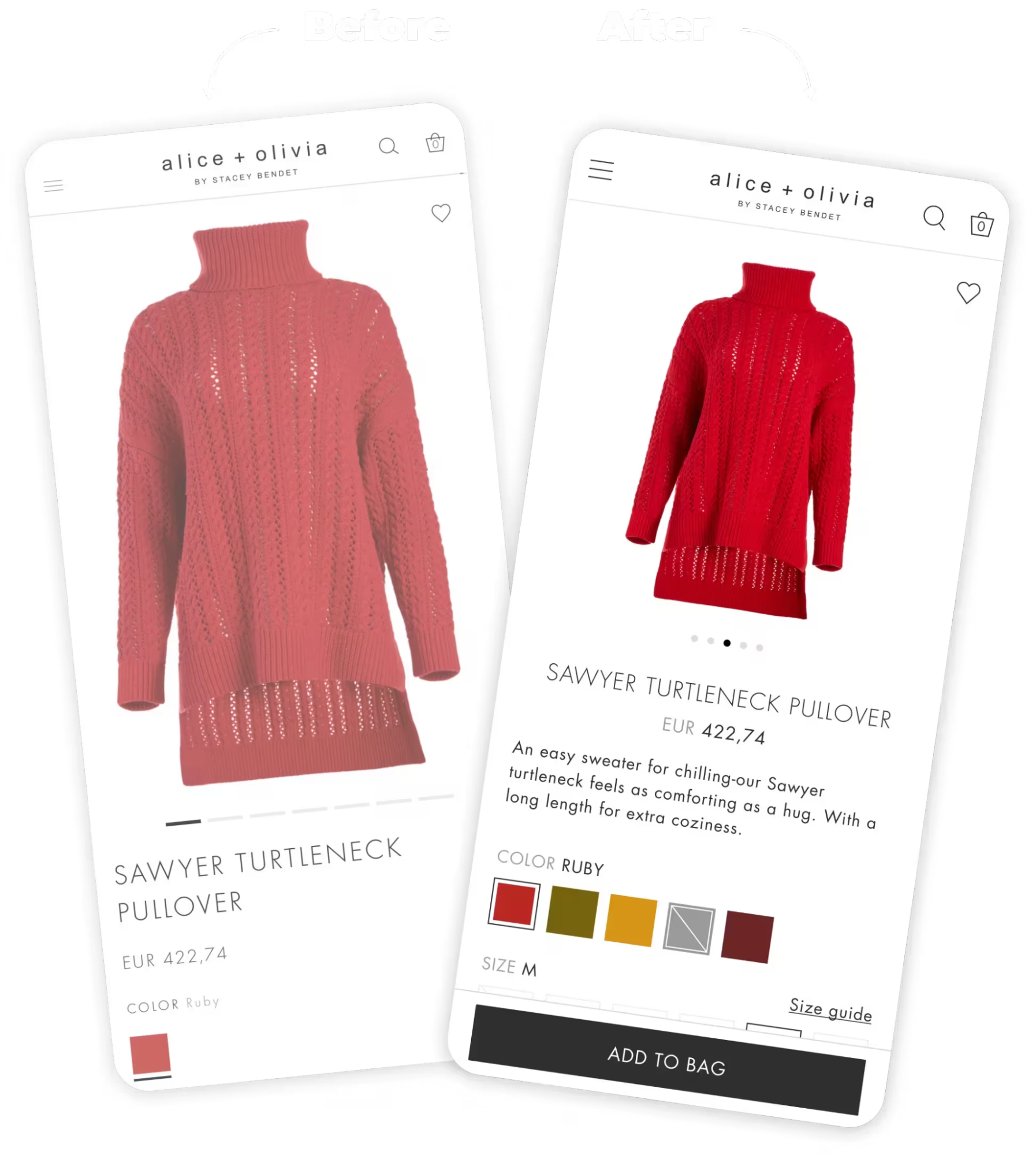
UI/UX Audit Example: Alice + Olivia
In 2021, Studio did a UX audit for Alice + Olivia, Stacey Bendet’s fashion brand worn by the likes of Michelle Obama, Beyonce, Gwyneth Paltrow, and Jessica Alba.
During the audit, our team aimed to strike the perfect balance between established e-commerce best practices and innovative shopping features to elevate the user experience.
We focused on enhancing PLP discoverability, refining search and filtering, increasing homepage marketing flexibility, simplifying the return process, and ensuring the fastest possible checkout.
It resulted in the following:
We also tightened up the checkout process with a status indicator for the stepped checkout approach, cleaner input fields, a quick selection of payment methods, and a guest checkout.
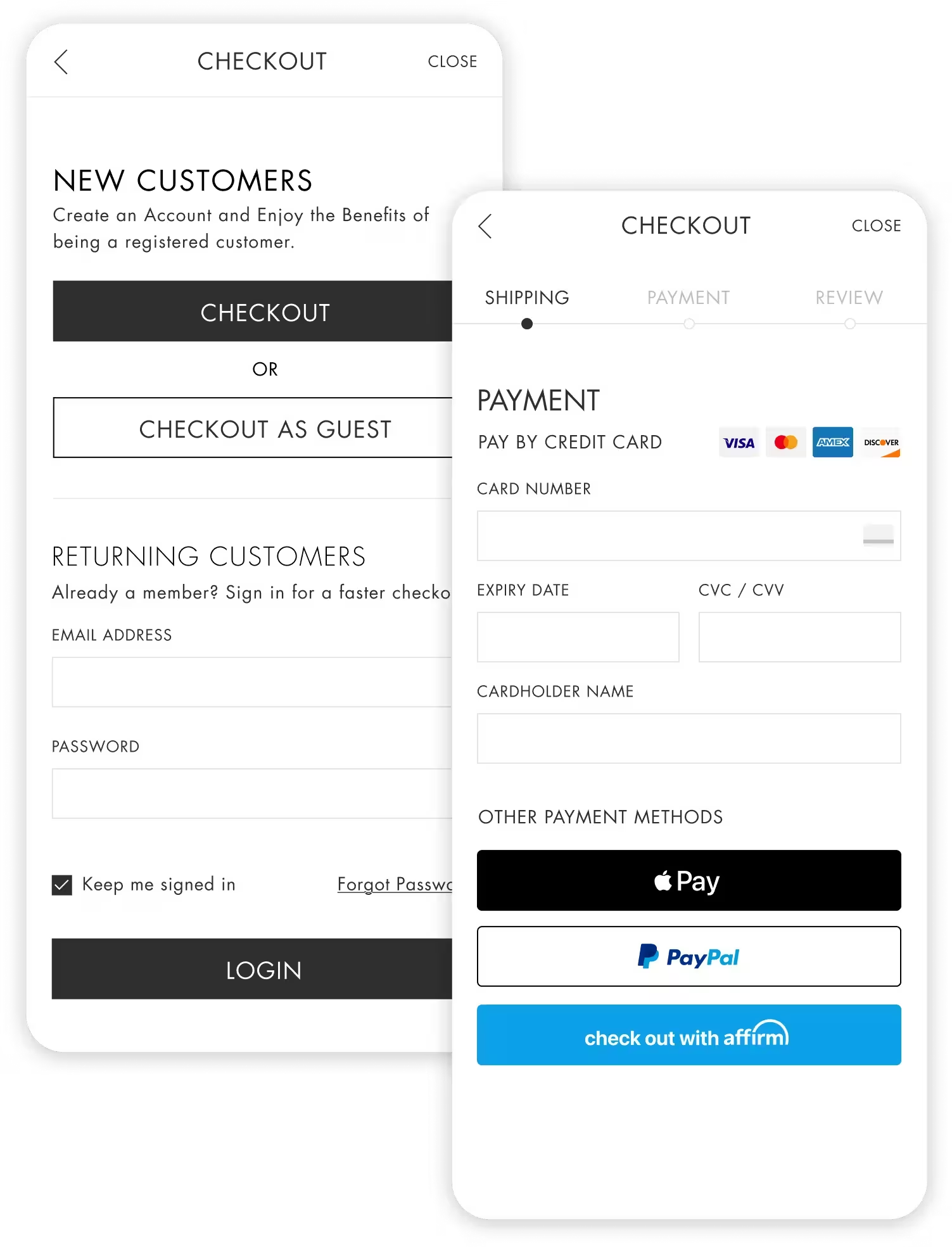
Most importantly, we looked at how to best serve relevant search results to dedicated customers and how to expedite their shopping and checkout experience. Enter My Fit. A tool that saves size and shopping preferences specific to Alice + Olivia, so customers shop from PLPs and PDPs relevant to their saved sizing.
Conclusion
UI/UX audits are usually necessary when the original design doesn’t meet the customer’s needs. That can happen when the user journey isn’t properly considered, or the market and competitive research isn’t done well during design. Our team at Studio are experts in product-led design, which puts the user’s experience at the center of the UX solution. If you need help solving your UI/UX concerns, build with us. Or check out our portfolio for visuals.
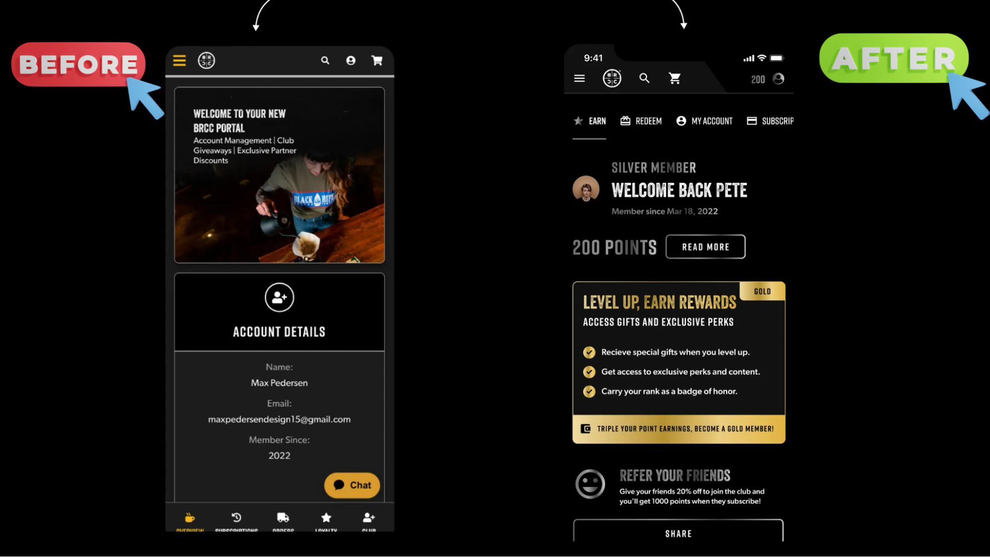
Source: https://buildwithstudio.com/portfolio/black-rifle-coffee-company/
Interested in more than the design of your app? We will guide you through strategy to development; take a look at our other services.
Frequently Asked Questions
How long does a user experience audit take?
A typical user experience audit can take up to two weeks, depending on the user base and the segment(s) you are analyzing. If you are conducting a comprehensive UI/UX audit, you will need a couple of months.
What is the difference between a conversion rate optimization (CRO) audit and a UI/UX audit?
Key differences between a CRO and a UI/UX audit lie in the goals, scope, and focus of the two analyses. CRO audits target elements that directly influence conversions (CTA buttons, for example), while UI/UX audits have a broader focus on the full user experience.